Storage Saga
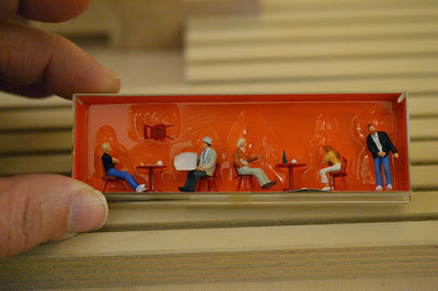
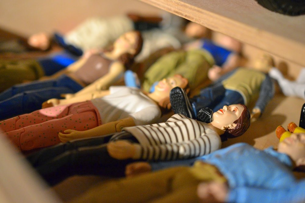
I'm a storage machine. Can't stop. For the past few months (!), I've been working toward a more sane collecting existence. This has extended to my real home as well. We have decluttered and pared down, so I have been reluctant to add new miniatures to my collection. This has meant selling one of my houses (a Brio "Chalet" from 1963) and pushing myself to take stock of everything I have collected since 2008.
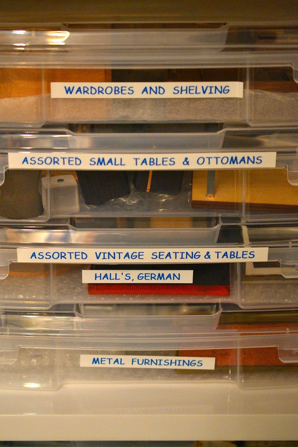
I'm probably about 3/4 of the way there. The biggest step was buying a ton of storage boxes from Michaels, which I managed to get on clearance, and filling then systematically. We bought a label maker, and I put it to use!
Boxed In
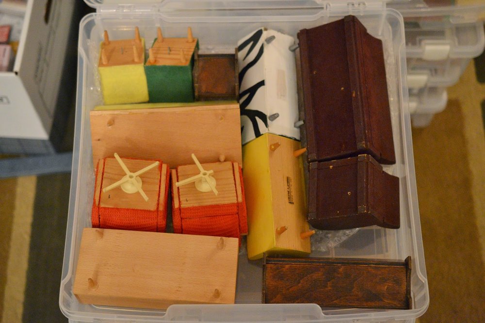
I've been exercising some serious willpower and have not bought any new miniatures (and certainly not houses!) in quite some time, primarily motivated by the mess of my collection these days. I bought storage boxes from Michaels and have been boxing up furnishings bit by bit to try to get more organized. I actually went through them pretty quickly, so I will have to get more to continue. Progress is happening, just slowly...
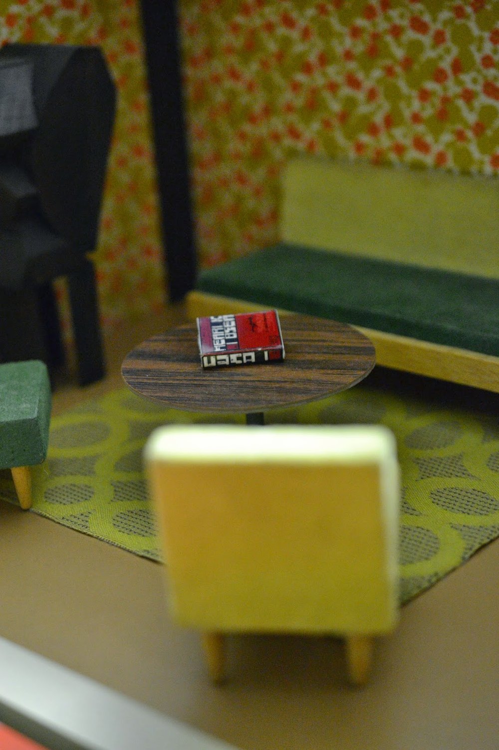
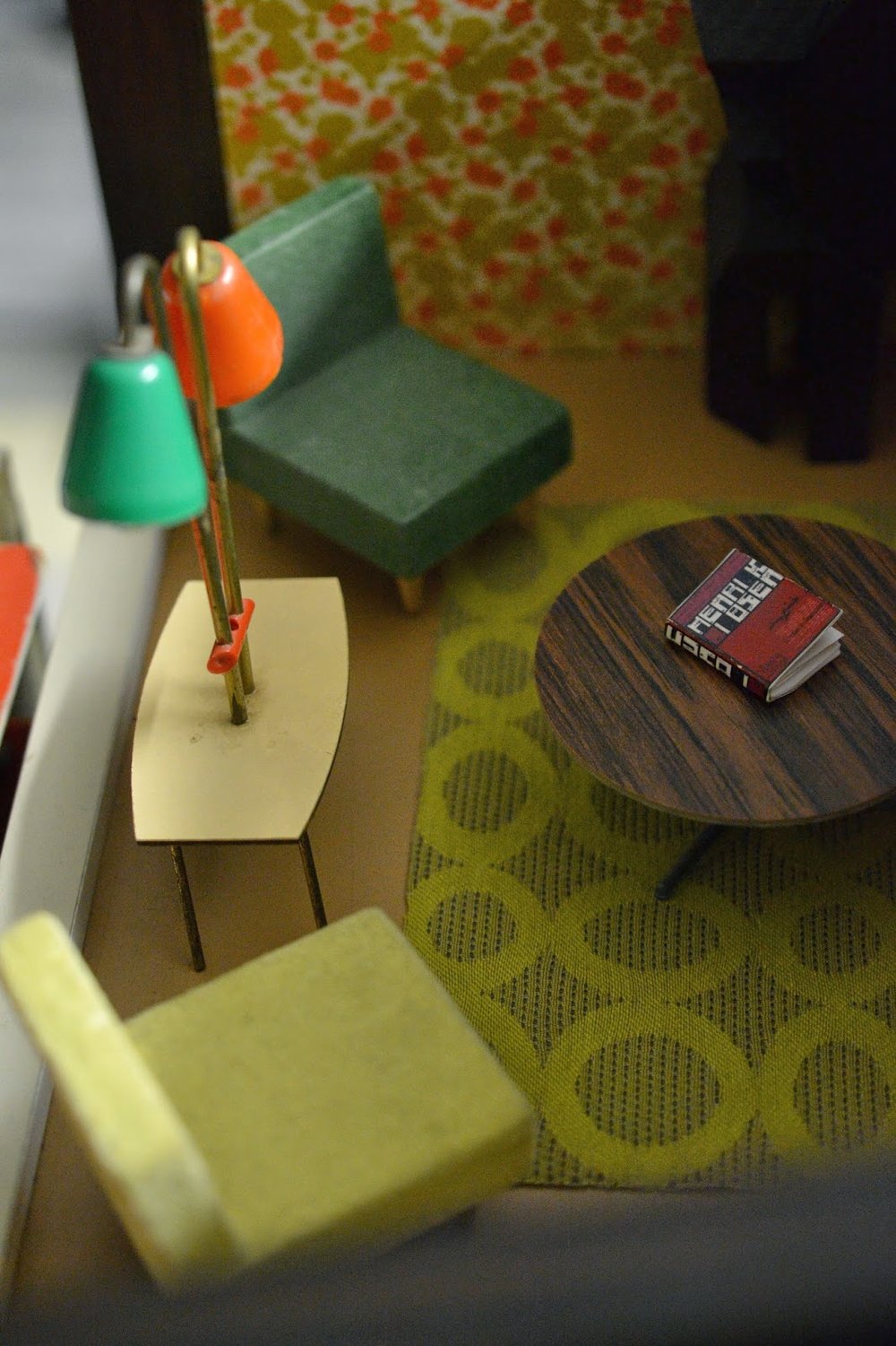
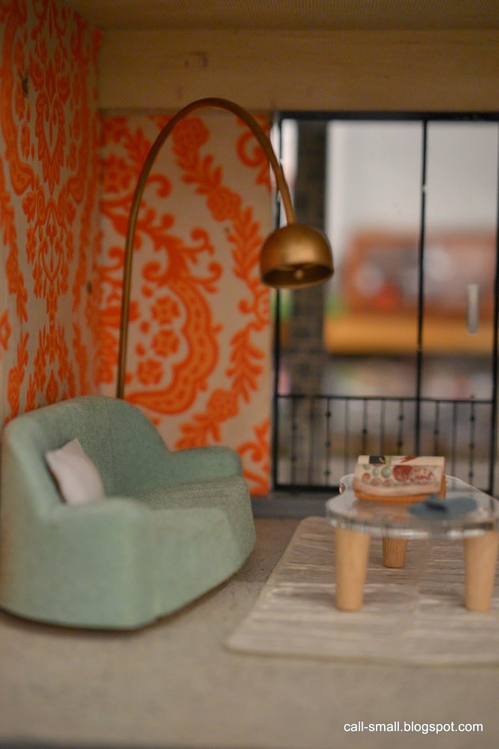
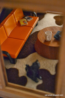
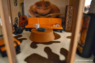
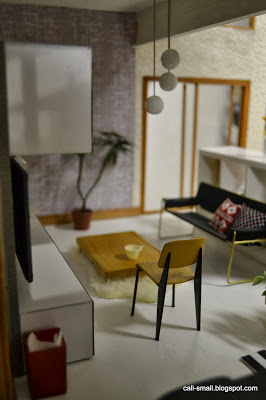
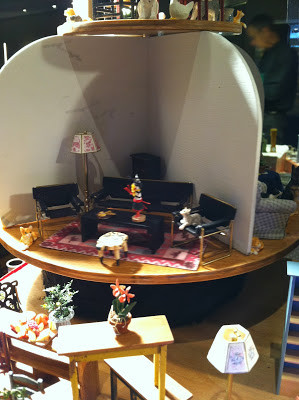
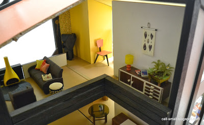
I couldn't help but to arrange a super quick scene in my Bodensee with some boxed pieces.
Within the next few weeks I hope to free up some additional space in our laundry room so that we can move things around and maximize space. There are so many little projects I'd like to get to!
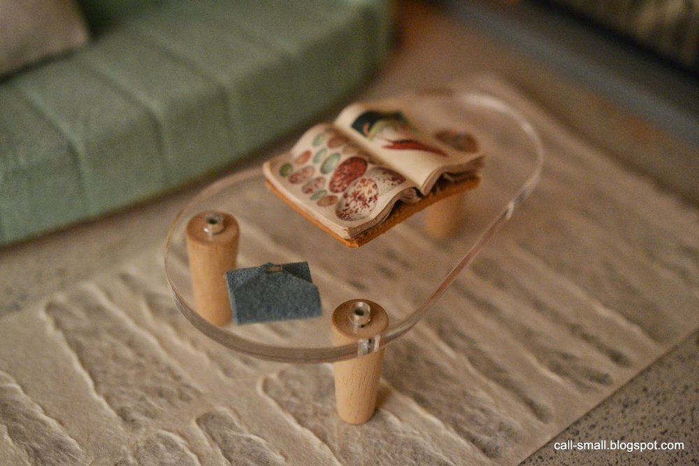
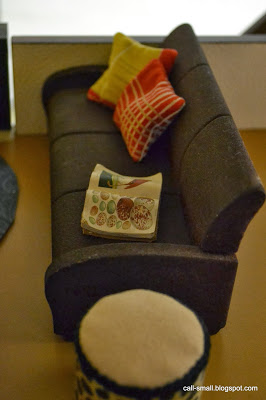
Credits: Couch, lamp, side table, and chairs are vintage German; coffee table is Brio; sculpture is Bozart; rug is minimodernistas. Accessories are Re-ment and assorted dollhouse finds.
ARC Dollhouse
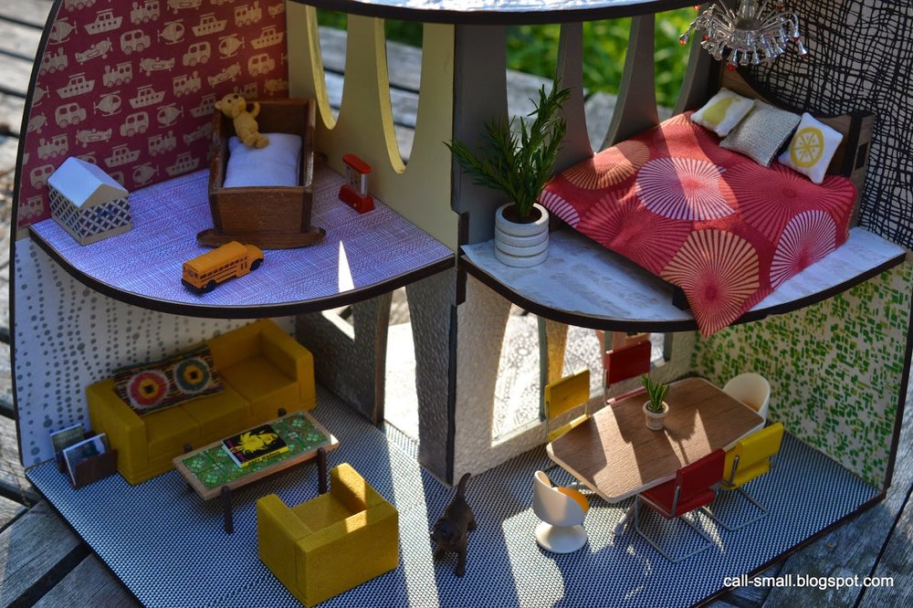
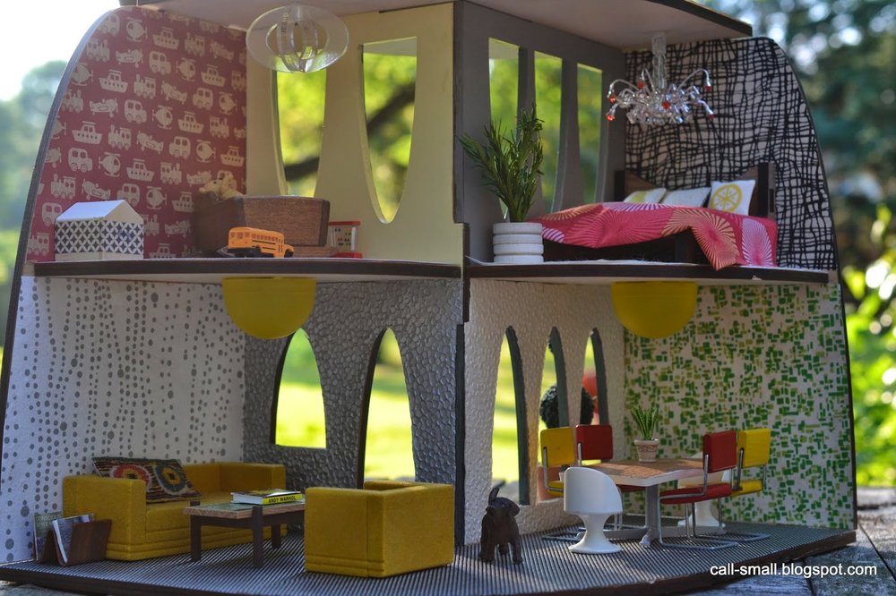
The ARC is a 1:16 scale house that requires simple assembly. Made of plywood and hardwood, the owner has a blank canvas of a house that they can paint or paper. While I was excited about the prospect of decorating my ARC, I knew it would be difficult to choose the decor (so many choices!). So, I let spontaneity be my guide for the most part. I did not have a particular color scheme in mind, but I did have some tubs of sample Valspar paint from Lowes that I bought some months ago because I liked the colors. So this is how butter yellow (nursery), dove grey (bedroom), and forest green teal (exterior) came into play.
The wallpapers in the bedroom and dining area were chosen intentionally for this house. I went to the Paper Source to find papers with a small scale pattern and loved these two. The other wallpapers in silver and creme are trusted designs from my collection, purchased at Kate's Paperie a few years ago.
The flooring on the ground floor is a placemat, and the bedroom upstairs has a delicate pattern from the Paper Source. I used a red patterned scrapbook paper for the nursery floor, but there was a previous iteration that didn't quite work out. I had a circle stencil and used the butter yellow paint to create a circular pattern, but I didn't care for the result. I think I should have done less circles...oh well.
The furniture was a bit trickier...the scale is closest to 1:16, but the curved floor and wall space made it challenging to coordinate pieces together. The bed and light fixture in the nursery are from the walnut furniture set sold by 3 Star Studio, and the rest of the pieces are from my collection. You'll see a mix of vintage Lundby (roof set and coffee table in living room), Strombecker (living room couch and chair and dining chairs), and Fisher Price (dining egg chairs).
All in all, this was an entirely fun and enjoyable experience. I also had the pleasure of hearing directly from Krista back in April about the house and what inspires her and her husband Zak at 3 Star Studio.
How did you approach the design and layout of the house? Can you discuss the choice of materials and the 1:16 scale?
The size also lends itself to modest material use, which is an important part of any decision we make, in life and business. We use wonderful, natural hardwoods and plywood from a sustainable family farm in WI.
We are also currently working on two more dollhouse designs: a cabin and a row house. And a little bit about our ideas:
We hope to promote modest, beautiful, graceful, playful, sustainable living for all ages. We love smaller spaces, mid century design, modest living, indoor/outdoor home areas, DIY projects, thoughtful use of resources and - most importantly - intense beauty, cultivating the imagination and great comfort in life! We want meaningful, not excessive, living. We'd love for these ideas to take flight in playtime and family time so that it seamlessly fits into a way to see the world. In these spaces, we hope that young and old try out all the ideas and colors and patterns and materials they may be hesitant to use in their own 'big' space. Let's ALL play! Perhaps this can translate into our 'big' life, too!Thanks so much to Krista and Zak for sharing their work -- best of luck on future things, and keep those designs coming!
Horrorstör Book Cover

As I hinted in this post, I have been working on a unique and exciting book cover project since the winter. I can finally share it and am thrilled with the results!
Introducing....Horrorstör by Grady Hendrix!
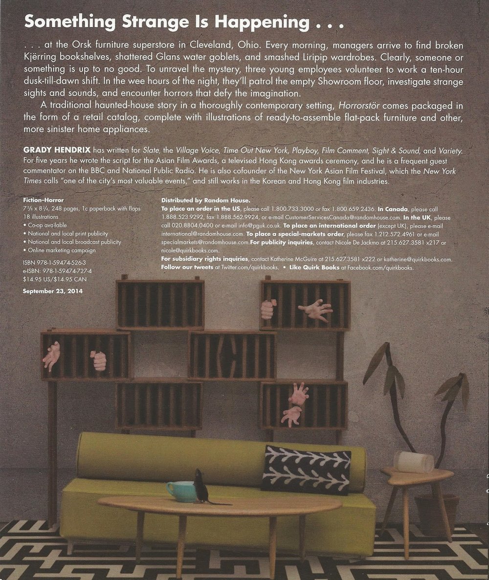
Published by Quirk Books and due out in September 2014, Horrorstör is a murder mystery set in ORSK, an IKEA-like store. I styled and photographed the front and back covers and it was an exciting journey to bring the project to completion. I learned a lot along the way, and am proud of the outcome.

The author, Grady Hendrix, is a writer and former film critic who is one of the founders of the Asian Film Festival. He has written fiction and non-fiction, and Horrorstör is a sharp, spooky ghost tale with a sense of humor.
Intrigued? It gets better.
The book is sized and packaged like a retail catalog, including illustrations of ready-to-assemble furnishings. (I cannot reveal the interior at this point, but the publisher will soon.) The catalog approach was the key inspiration for the cover design, and of course was driven by the story line. I worked with Andie Reid, one of Quirk's very talented designers, and she provided the overall creative direction: the front cover should be a closeup of a showroom-type interior, be well-lit and modern, and employ a blue and yellow accents; the back would be a creepy interior counterpart.
As with my last cover, Dear Girls Above Me by Charlie McDowell, the cover came together after a series of months collaborating with the publisher. While the vision was clear from the beginning, Andie and I both contributed new ideas along the way to produce the best possible results. I tried new techniques and tools with this job -- I bought an external flash and macro lens, which greatly improved the quality of the photographs, and I also utilized Olioboard to help visualize the space and exchange ideas with Andie.
After choosing my trusty Citadel dollhouse as the location, a big part of my job at the beginning was sourcing all the furnishings for the project, which took a number of weeks. The starting concept included a dining scene for the back cover, inspired by actual IKEA products. We gravitated toward these furnishings:
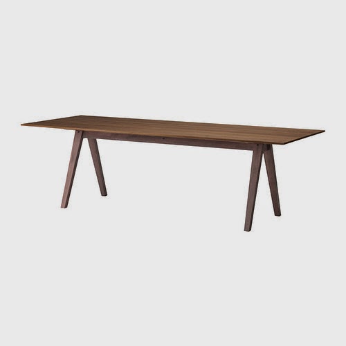

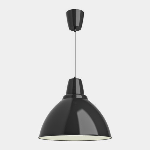
I worked with Patie of Minisx2 on Etsy, and she was wonderful in producing such close matches! We initially incorporated some spooky elements like knives and tipped over chairs:
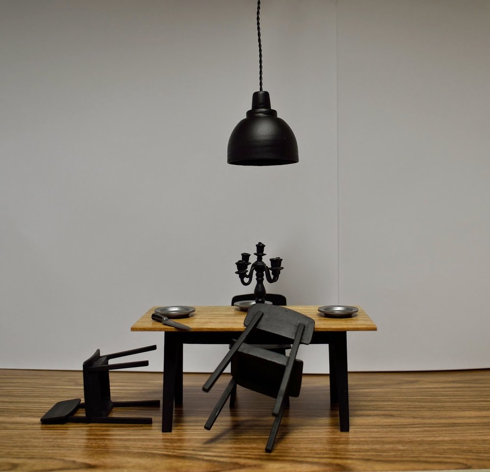
Unfortunately, none of these pieces were used, since it was decided to do a version of the living room scene on the back instead.
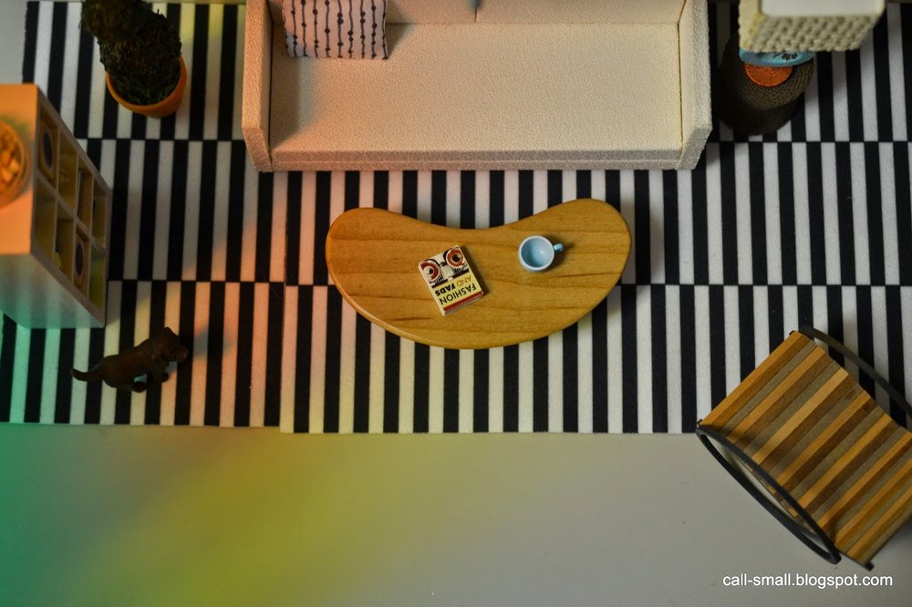
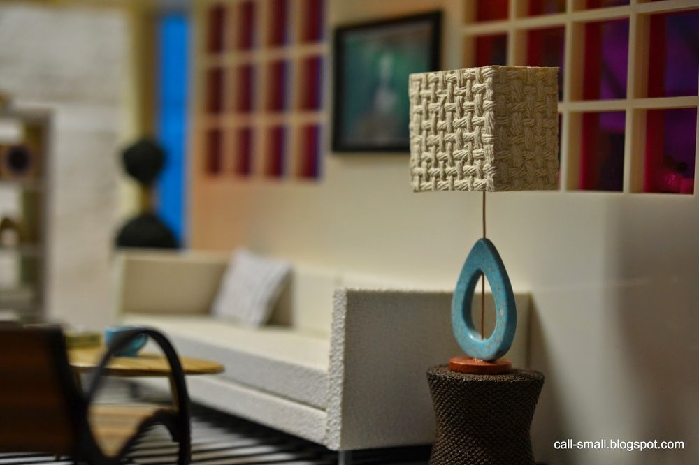
The living room scene was really fun to put together, and the unique shelving unit by Patie nicely tied it all together. It's a great modular piece and so well made. Patie also made the boomerang tables. The Tootsie Roll sofa by minimodernistas was already in my collection and it ended up being a great fit. I chose a few different minimodernistas pillows and the arrow one worked best...it was my way of pointing to the spooky back cover. :)
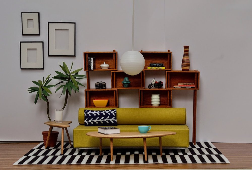
The frames are from Paris Renfroe, who also provided an arm chair and gorgeous black console, but they got edited out in the process. The plant is AG Minis and the rug is IKEA (of course!). The flooring is Contact paper and worked quite well. I used bright white craft paper for the walls, held up with binder clips. Here is a picture of the work space, which also shows a Lundby hanging fixture, also not used:

For the back cover, I shot the same living room scene, but stripped it of many of the accessories. Andie then did her magic with PhotoShop and transformed it into a mirror image of the front. It's an utterly dark and murky scene, with all new details by Andie on the floor, walls, and inside Patie's shelving unit. So clever!
I hope you enjoyed this cover reveal and I am happy to be finally in a position to share the news. The book is available for pre-order now on Amazon and Barnes & Noble, and is also available on Kindle, Nook, and eBooks. Also, the Book Smugglers site is doing a giveaway -- go enter now!
Kaleidoscope Art
It was fun to pop into the Kaleidoscope House for a quick scene this weekend. It is one of my favorite houses, mainly because of the colorful shadows and light, which can inspire but also challenge interior decorating.
This scene was primarily motivated by the very cool "painting" by Jaime Derringer hanging on the upper level. I've admired Jaime's work for a while, and have one of her (1:1 scale) drawings. Jaime is the founder of the highly influential blog Design Milk, and also creates colorful abstracts and sketches actively.
My "painting" is actually a work entitled From Above it Looks Like a Giant Mess that Jaime posted on her Instagram feed. I immediately loved the color scheme and energy; I printed it out, edged it with some washi tape, and it was good to go!
What's been motivating you lately???
Credits: Couch is minimodernistas; boomerang table is by Patie of minisX2 on Etsy; side table is miniatures.com; chair is by the amazing Pepper of MitchyMoo Miniatures; bookshelf is by Lene of Dragondee; plant is AG Minis; rug is IKEA; lamp is by Maryann Roy. Accessories are Bozart, AG Minis, Re-ment, Jazams, Dragondee, and minimodernistas.
The time it took me: 40 minutes
New Acquisitions: Adrian Cooke and Kitty Puppenmobel
I know, quite a combination of acquisitions here...but I like the unexpected nature of this, and it speaks to my inclinations as a collector.
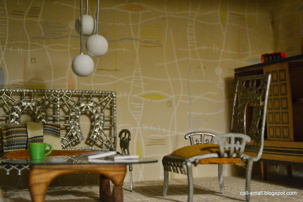
This soft metal chair set was made by Adrian Cooke of the USA in the late 1800s. I've seen these chairs before in reference books and on other blogs so they caught my interest when they popped up on eBay; my best offer price of $30.99 was accepted. I challenged myself to use the chairs in one of my midcentury houses, which was fun.
The Kitty Puppenmobel pieces came in their original box, very cool. Also bought on eBay, the set, which dates from the early 1960s, was a best offer purchase of $18.99. These pieces were not as difficult to use in one of my houses, but the light blue and yellow colors were a bit of a challenge.
Any new "opposite acquisitions" lately? Do you like to collect like this too?
Credits: Adrian Cooke scene: table by PRD Miniatures; globe lamp by minimodernistas; cabinet is vintage German. Accessories are Dragondee, Re-ment, Michaels, minimodernistas, The Shopping Sherpa, and Lilu Shop on Etsy. Puppenmobel scene: table is Ryan's Room; arc lamp is an eBay find; initial pillows by Dale's Dreams; side table by Patie of minisx2. Accessories are K. Delaney, Ray Storey, and dollhouse show finds.
The time it took me: 45 minutes combined
A New Midcentury Dollhouse
Whee! A new midcentury style dollhouse has made its debut! The 1:16 scale laser cut ARC Dollhouse, designed by Krista Peel of Three Star Studio, is intended to be a simple and sustainable canvas for dollhouse play. I was thrilled when I received an email from Krista announcing the new house, and eagerly await it so that I can share it with you.
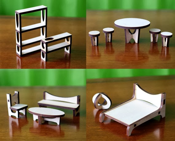
It comes flat-packed and looks quite easy to assemble. The house also comes with either baltic birch or walnut furnishings, and there are many possibilities for customization. The house retails for $65 on Etsy, the baltic birch furniture is $35, and the walnut/plexi set is $50.
The house has already created some buzz in the 1:1 design world -- Design Milk wrote about it this week. Hopefully that means that there is more to come!
I intend to share more soon.
Toy Fair 2014
 |
| The new Paul Frank line from Tynies |
SO. I was intent on getting to the Toy Fair. As you may know, these events are enormous...hundreds of vendors, aisles and aisles of booths, and crowds of people. I've developed a bit of a system over the years that works pretty well for me.
First, I attend as press, so I am able to strategize on my visit in the press center, with access to the show catalogue and a place to sit and store my coat and extraneous stuff (very important -- you don't want to be carrying lots of stuff around).
Then, I look through the catalogue to determine which vendors I want to see. I know many in advance, but then there are always new ones to discover. The vendors are organized by "Product Zones" (Action Figures, Board Games, Dolls, Youth Electronics, etc) and are grouped according to these categories. The row numbers range from 100 to 6400, and increase by 100 from row to row. That is A LOT to see. To focus my visit, I create a written list of vendors and numbers and then put them in numerical order. Sometimes I make appointments in advance, but this time I did not.
Then, I head on my way and usually spend 4-5 hours total going to my planned booths and others that I see by browsing . This year, I brought my camera, which worked much better than my phone!
Here are the highlights!
Safari Ltd
Safari Ltd makes very high-quality and realistic plastic replicas and it was great to see some new pieces from the Good Luck Minis and TOOB lines. |
| For a Southwest-inspired interior, perhaps?? |
I am in love with the American President busts!
Playmobil
I did not make it in to the Playmobil booth last year, but managed to visit it this time around and it was great. The booth is organized by month and displays new products appearing in those given months. One of the showcase pieces was a shopping mall, with a variety of stores and innovative accessories and people. Did you know that three years ago, the company decided to make the bodies more realistic? You can see this especially in the head and feet. |
| A wedding cake! |
 |
| Look at the boxed mini Playmobil! |
 |
| Check out the mini house! |
 |
| Cool tents and accessories |
All in all, some really terrific stuff coming this year.
Maisto
They were showing a new line of Harley Davidson and "Sons of Anarchy" 1:12 scale motorcycles. Fabulously detailed. Very cool.
AREAWARE
I had to stop in at one of my favorite booths -- the very creative bunch over at AREAWARE. They were showing some new Cubebots: Ninjas! I saw Owner Noel Wiggins, and he commented that they really needed the bots in black and white, and Ninjas seemed the most appropriate nomenclature. I agree! They come in sizes Micro and Small.Noel also showed me a new product, Blockitecture, which was designed by the student winner of Rochester Institute of Technology's annual design competition. You create constructions by balancing the colorful blocks at challenging, cantilevered angles. Clever!
Lille Huset
Alyson Beaton, the whiz behind the paperboard dollhouses of Lille Huset, was showing for the first time at Toy Fair. It was great to see her there with some new offerings, including a graphically awesome barn and some new furniture and people, part of the new "Brooklyn" set.I look forward to seeing what's next for her!
Urban Canvas
I popped over to Urban Canvas next, a relatively new company started by interior designer Maria Chee that aims to encourage creative, expressive play with paperboard dollhouses and structures. It was nice to see a few new pieces in her collection, namely a modular set of shops and a bistro.The walls can be configured and colored according to one's imagination, and then be packed away!
Roominate
Roominate, started by two female engineers with a Kickstarter campaign, was developed to encourage young girls in the STEM fields (science, technology, engineering, and math). The dollhouse sets are modular and wired, so you can build a range of structures that are powered by motion or light.The product has experienced a great deal of success in a short time, and is continuing to expand its offerings.
Tynies
Tynies are simply awesome. They are very detailed glass figurines that come in a variety of designs. I use them in my scenes a lot, and luckily my local toy store carries them. The collection just expanded with a new Paul Frank line, as well as some very yummy looking desserts.Their packaging is changing, for the better I think. Currently, the pieces come in small plastic boxes that can be tricky to open (see above picture); the new packaging is a snap sealed plastic shell that stacks. A definite improvement!
MiWorld by JAKKS Pacific
The last stop of the day was at the JAKKS Pacific room, where I wanted to have a quick look at the MiWorld play sets (see my review here).I was told that a new set is forthcoming -- cannot say which one, but definitely a high-profile brand. Look forward to that.
Whew! That does it for this year's review. Hope you managed to stick with me through this lengthy post. I'll leave you with a final few pictures from a sweet line of cloth dolls called Pocketopia. The creator, Rita Ross, has put together a lovely collection with personality and care and was showing for the first time at Toy Fair.
Keep creating, people!
Macro
The book cover project has been keeping me very busy these past few weeks, so I have not had much time to play around with my collection. It shouldn't surprise you that I have created a monumental mess as a result of this new endeavor since it entails lots of setups and accessories; I have definitely fallen behind in my mini house-keeping. There's furniture all over the place, tiny cups and saucers, books, shoes, rugs, you name it. To be fair, the mess was out of hand before I started the book cover, but now it has reached crisis proportions!
The chaos gives birth to some progress, though. I bought a new macro lens and flash for my Nikon camera and have been enjoying them.
 |
| The flooring is made of pieces broken off a placemat! |
Do you ever switch up your equipment to produce different effects? I'd love to hear about your experiences.
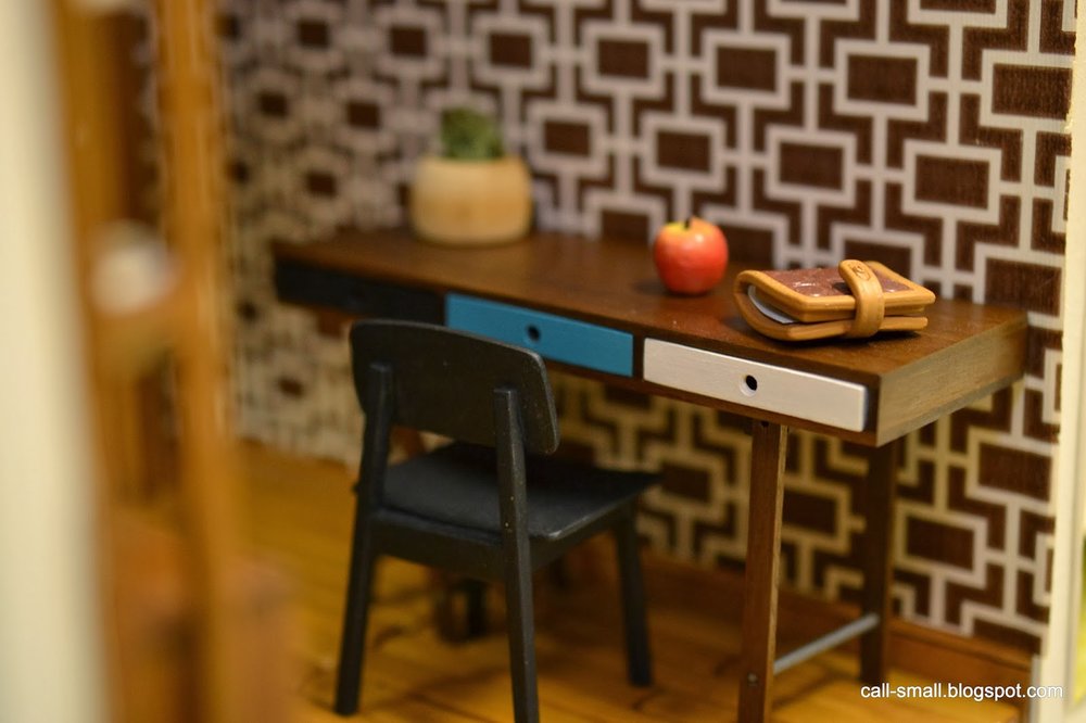
Credits: Desk is by Patrizia Santi; chair is by Patie of minisx2; light is vintage Lundby; shelving unit is PRD Miniatures; round chair is CB2, spray painted black. Accessories are Re-ment, L.Delaney Miniatures, Ray Storey, Dragondee, Michaels, vintage eBay and dollhouse show finds.
The time it took me: 57 minutes
Midcentury Metal Dollhouse Furniture
I love pieces that involve a bit of research. In the past, I have acquired houses, room boxes, and furnishings that just beg for more information--where were they made? when? by whom? for whom? It is certainly fun to speculate on these questions, but even more fun (and rewarding) when they are answered.
This time around, I find myself with a mystery set of metal midcentury-style furniture, purchased on eBay ($22). I love the lines of the pieces, and did not realize their true character until they arrived to me.
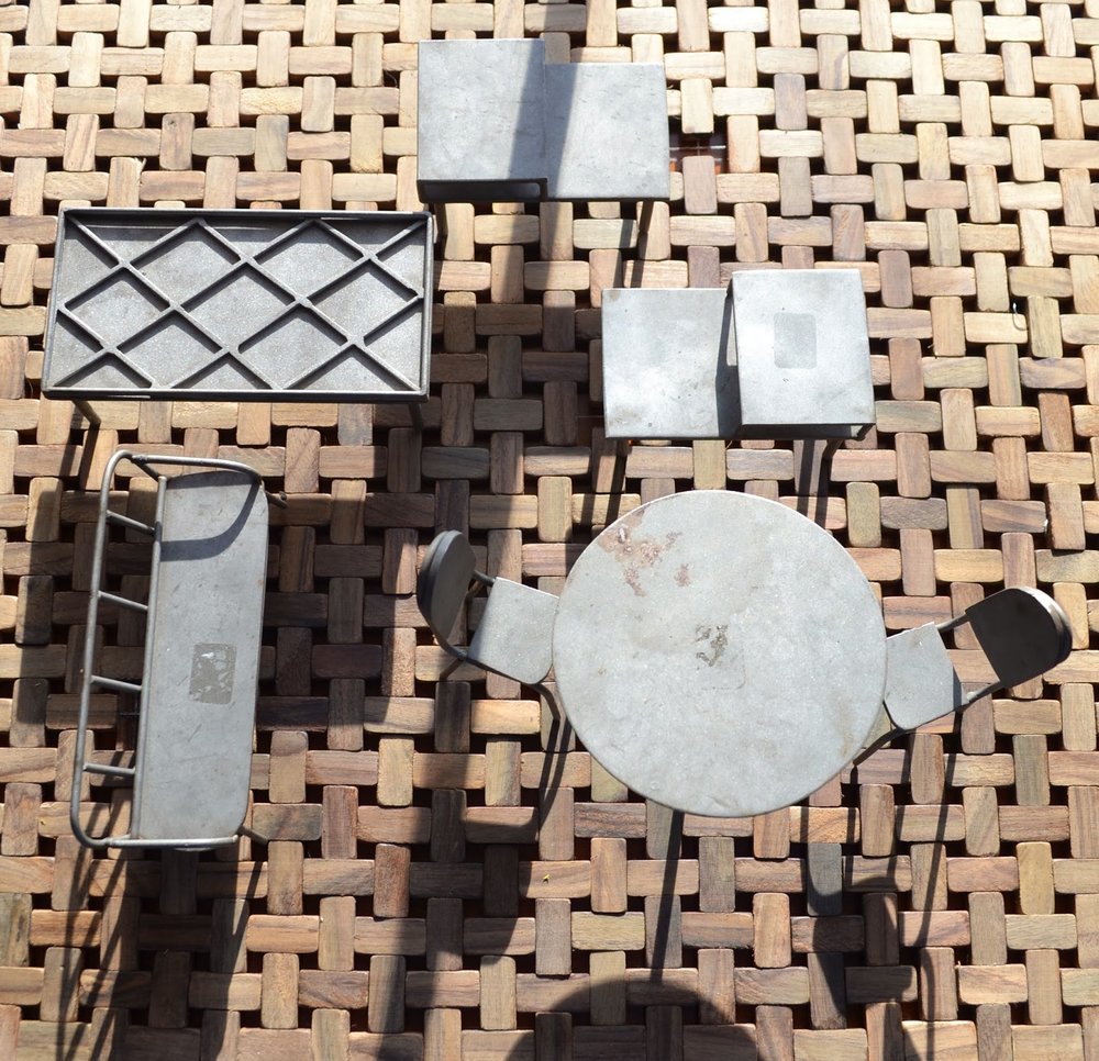
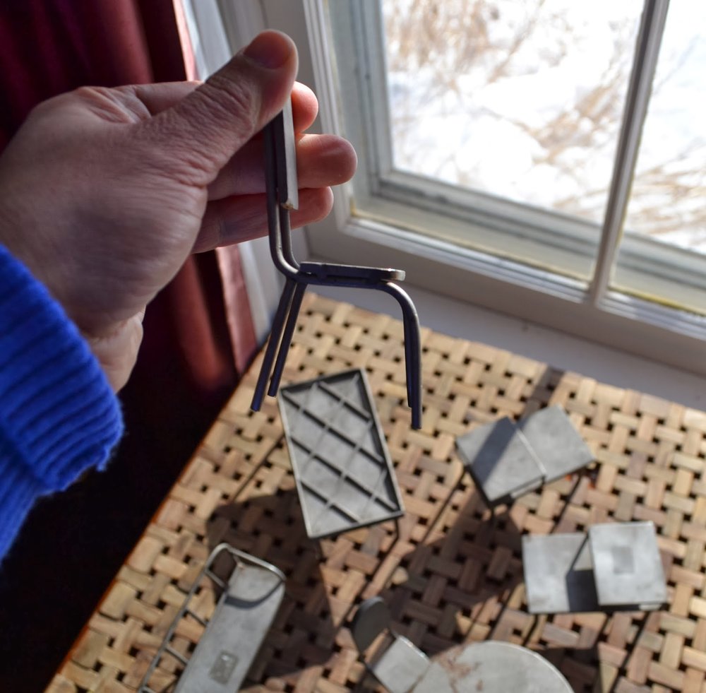
These are incredibly heavy and sturdy. There are seven pieces in all: a tulip-style table and two chairs; a lovely Windsor-style bench; a large coffee table with recessed lattice work; and two side tables. The heftiest piece is the tulip table, which probably weighs about 8-10 oz. The material is the same for all of the pieces, a very dense metal with a matte sheen. Everything looks handmade, with soldered joints and well-constructed lines.
As you can see, the pieces have suffered some scuffs and show marks from adhesive price tags, but otherwise they are in really good shape. I have to believe that they are vintage pieces based on the style and the patina, perhaps from the 1960s?
Has anyone ever seen pieces such as these? I checked in all of my dollhouse reference books and did not see a match.
Any ideas on possible refinishing? I am torn...on the one hand, I love the patina, but on the other, I'd like to even out the surfaces. I guess a matte silver spray paint is an option, and perhaps sanding is as well.
Or...I could just hide the flaws
Please comment to share information or ideas! By the way, thanks for commenting for all these years -- I started this blog in January 2009 and it has been a fun ride!
Accessories are Re-ment, The Shopping Sherpa and Lilu Shop on Etsy.
The time it took me: 10 minutes
Another Book Cover
Here's a few snippets!
I hope you are intrigued!
This is also an opportunity to acknowledge some terrific miniature artisans whose work is featured in the current iteration of the images: Patie of minisx2, Paris of PRD Miniatures, and Doris of minimodernistas. Thanks to all!
I will share more when I can...stay tuned!
MiWorld Play Sets
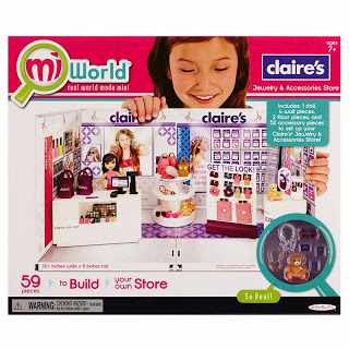
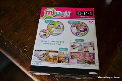
It's no secret in the world of modern miniatures that children's toys present a wealth of opportunities for furnishings and accessories. Right after Christmas, Cindy of Snowfern tipped me off to a new line of miniature play sets carried exclusively for the month of December at Wal-Mart called MiWorld. And then The Shopping Sherpa asked me separately if I had seen them as well, since she was intensely curious about the scale and quality.
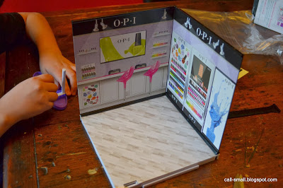
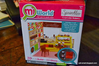
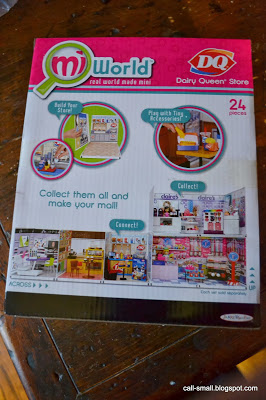
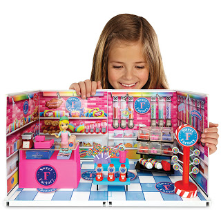
The sets are modeled on actual retail and food stores, namely Claire's, Sweet Factory, OPI, Dairy Queen, and Sprinkles Cupcakes. The toys are targeted at ages 7+, and consist of simple, plastic constructions that also snap together across sets (vertically or horizontally), so you can create your own retail mecca.
 |
| Both images courtesy of MiWorld |
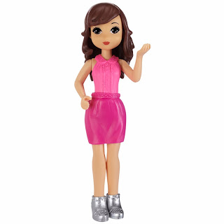
In addition to the stores, there are accessory packs that provide extra minis for all the stores, as well as figures.
 |
 |
| Images courtesy of MiWorld |
From the website, it is difficult to tell the scale of the rooms and pieces, but it seemed they were close to 1:12.
Only one way to find out!
I managed to get to my local Wal-Mart and picked up their last three sets--OPI, Dairy Queen, and Sprinkles. They were $10 each, which did seem quite reasonable at the time, and then even more reasonable once I went online to eBay! The sets are selling for three or four times that amount -- crazy!!!
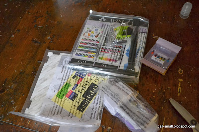
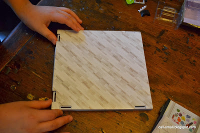
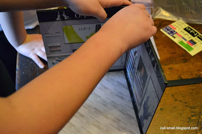
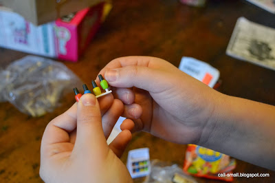
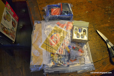
I had two surprise helpers: my two boys, aged almost 7 and 11. They had grudgingly tagged along with me to buy my "weirdo dollhouse stuff," but then were excited by the Dairy Queen and cupcakes. So, I was able to engage their help in constructing all three sets to report back to you all on the quality and scale.
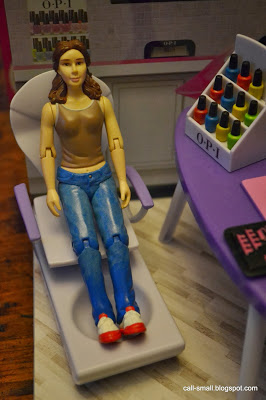
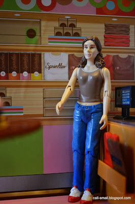
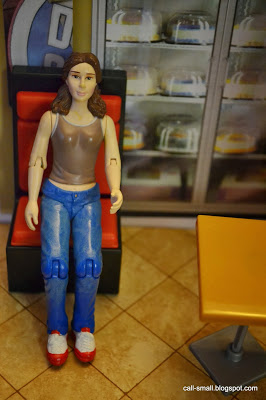
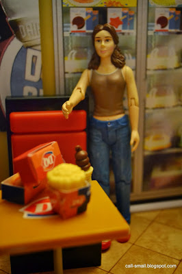
First: the sets are all closest to 1:12. YAY! I used a Kaleidoscope House figure to illustrate the scale.
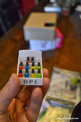
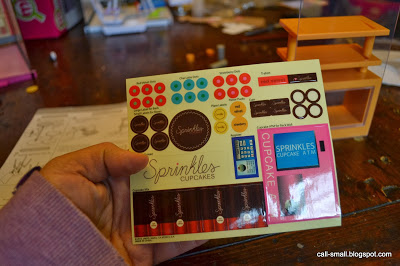
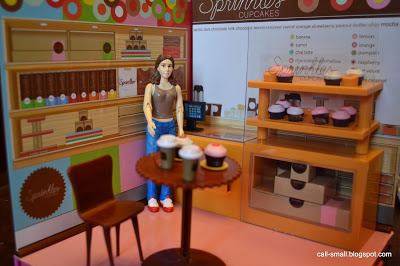
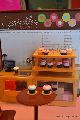
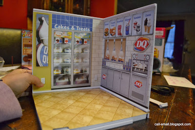
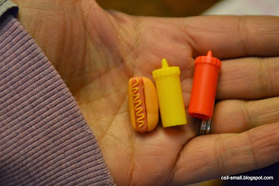
Second: there are some very cute accessories across all three sets. Notable mentions: Dairy Queen ice creams and shakes; OPI nail polishes and rounded chair; Sprinkles coffee cups and display case.
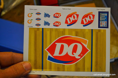
Third: the overall quality is quite good for the price, but there were common flaws across the three sets. The wall graphic stickers, while very realistic, were not evenly applied and bubbled in places. The paper flooring was bent around the edges. The small tables in the Dairy Queen and Sprinkles sets did not snap together and hold securely.
On to the pictures -- there are a lot, to help show you all the details.
The OPI nail salon is first!

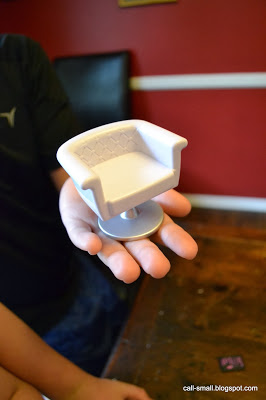 |
| This chair is definitely usable for modern mini scenes |
 |
| Very proud of his chair! |
Next up: Sprinkles!
 |
| Lots of little stickers... |
 |
| You can see the flooring and table flaws pretty clearly here |
And finally, the Dairy Queen.
What do you think?? I can say that I will definitely use some of the accessories and perhaps a piece of furniture or two. I might even go back to Wal-Mart to see if they have anything left, although the shelves were pretty cleaned out.
Anyone else have any sets? Do share!
And HAPPY NEW YEAR, all! Hope this year brings creativity and joy! Thanks for your ongoing encouragement and support of the blog.
Warmth
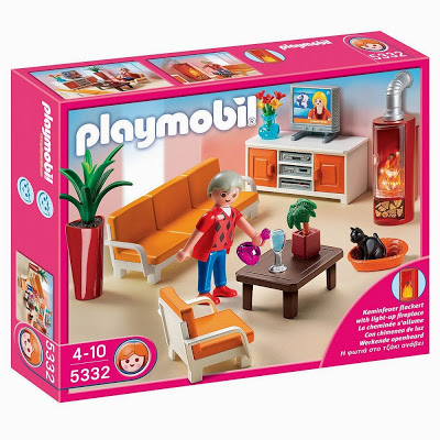
There are a few sources of warmth in this scene. It's a cozy little space, thanks to the CB2 Neville House's proportions. 1:16 or smaller fits best here. I've made use of a Playmobil living room set, which is scaled at 1:18. It is manufactured looking like this:
I had to spray paint something a flat black for a book cover job (yes, I got another one!), so I decided to spray over some of the pieces in this set, specifically, the wood stove, couch, and chair (I left the orange cushions and the cat was black already):
How about the warm glow given off by that fabulous column light by the amazing Pepper of MitchyMoo Miniatures??? She is a genius with minis and a warm person, to boot. Thank you again, Pepper dear!
See the fur teacup on the wall? As an art history major, Meret Oppenheim's creation from 1936 is one of the iconic pieces you learn about in discussion about Surrealism. Fabulous, no?
Happy New Year to all! Stay warm...!
UP
"UP." I like when a little word carries so much meaning. There is a visual clue for the word embedded in this scene -- easy to find, I think!
Speaking of up, I flew back from Amsterdam last week, where I was on a work-related trip. I have never been there, and it is a beautiful, magical city. While I only had very little free time, I tried to "feel" the place as much as I could: bicycles whizzing by, cobblestone streets, mirror-like canals, bridges, dimly lit streets at night. The canals were especially picturesque.
In the free time I did have, I visited the newly-renovated and reopened Rijksmuseum and the van Gogh Museum, where my head spun 'round from seeing all the masterpieces that I had seen in books growing up, such as van Gogh's Sunflowers.
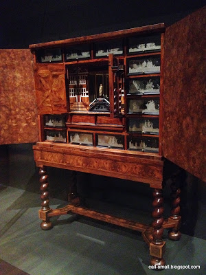
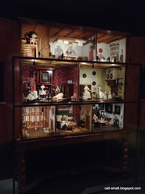
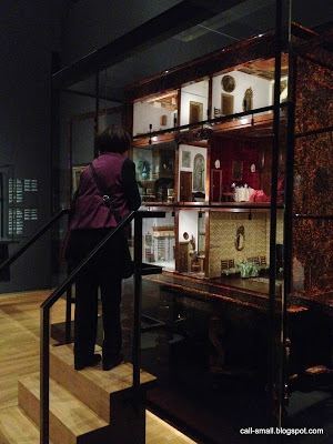
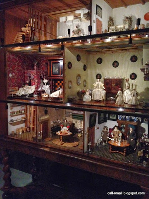
And...the Rijksmuseum has a room devoted to antique cabinet dollhouses. Stunning!!!
With all my running around, I never managed to have a photo taken of myself in the city...only a selfie in my hotel room, before heading out for another work function!
I met some lovely people, one of whom thoughtfully gifted me with the modern brown side chair and paint set in this scene. Thank you, C.!
I already had the sunflowers, nicely nestled in a vase by Ray Storey...
Hope everything is looking up for all of you!
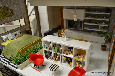
Credits: Bed is vintage German; side tables and wall sculpture by Pepper of MitchyMoo Miniatures; shelving unit and striped rug are IKEA; chairs are Reac; couch is an artisan piece by unknown maker; TV unit and coffee table by PRD Miniatures; clear table by Petite Princess; planters by TOMY; plant is AG Minis; lamp by minimodernistas; typographic letters are vintage. Accessories are Modern Mini Houses, Manor House Miniatures, Re-ment, L. Delaney, Ray Storey, AG Minis, The Shopping Sherpa, minimodernistas, and beads from Michaels.
The time it took me: 45 minutes
Philadelphia Miniaturia
 |
| Custom desk by Patrizia Santi -- all mine!! |
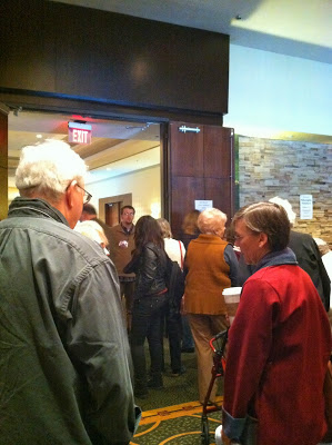
I went on Sunday, November 3, the last day of the show. I arrived shortly before the 11:00 a.m. entry time. After getting chastised twice by the guards for looking at some tables in the lobby before the doors opened (yes, just for looking), I went in to browse and buy.
The space was very open and filled with many vendors. Looks like this:
 |
| Waiting to get in |
 |
| Main room |
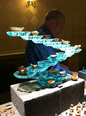
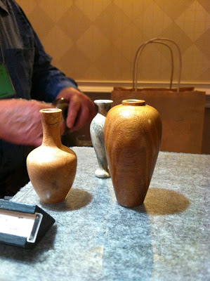
Such lovely stuff. Tom, who does custom wood turning in 1:1, let me know that this was to be his last show for miniatures. He believes his main audience is petering out and it does not pay to do the shows -- very sad! He will focus on his 1:1 work.
I was lucky to have some more conversations with other vendors, such as Ray Storey. He said the show was a very good success for him, especially his custom lighting fixtures. We chatted as he was wrapping up a $300 order, and he shared some of his new work, inspired by industrial lab works.
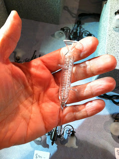
I love these pieces, which will be reasonably priced. This one will run about $7.
Looking forward to seeing more when they are available early next year! Of course, I scooped up a few vases!
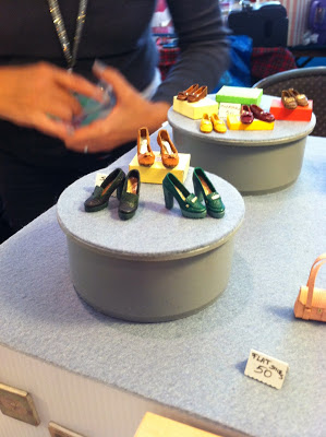
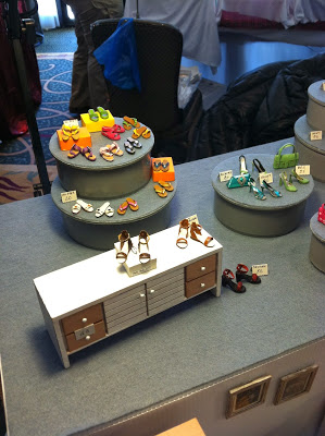
I was also fortunate to meet Italian artisan Patrizia Santi, whose miniature shoes have many fans here in the U.S. and abroad.
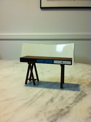
While I did not invest in any pairs of shoes this time around, I could not resist a modern desk, lovingly crafted and painted.
Cannot wait to use this!
On to Lauren Delaney's booth, also known as L. Delaney Miniatures on Etsy.
It was wonderful to meet and talk with Lauren -- we had a nice chat about making miniatures, photography, dollhouse shows, and books! Her booth was very prettily appointed. I spent some time book browsing and walked away with a few treats!
Next I found Dale's Dreams! Dale and I met a few years ago and she has been hard a work creating new lines of furnishings and accessories that she sells in her Etsy shop.
We, too, chatted for a while with her daughter, who was doing a fantastic job of promoting her Mom's work. She pointed out that Dale renews vintage pieces, and she shared a recent project involving a Petite Princess bed and vanity.
Great, isn't it? Please keep Dale in mind -- she is great to work with!
Then, I scooped up some bargain pieces and was on my way home after almost four hours of browsing. My spoils:
 |
| Ottoman from Dale's Dreams |
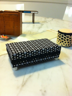 |
| Mod ottoman from Dale's Dreams |
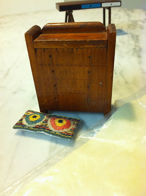 |
| Bargain pillow and dresser for .50! |
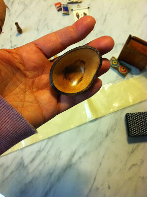
 |
| Wood pieces and rug for .25 |
 |
| Tom Frey's gorgeous work |
 |
| Another Tom Frey purchase -- had to get two! Patrizia Santi's desk is in the background. |
 |
| L. Delaney's treats! |
Credits: Fireplace is CB2; Couch and chair set is Strombecker; ottoman is Dale's Dreams; sculpture is a Kaleidoscope House accessory; chair is Dollyhome; credenza is vintage German. Accessories are Lundby, L. Delaney, Michael's, and Miniatures by Annina.
The time it took me: 15 minutes
Globe and Mail on Modern Miniature Design
 |
| A snippet from online -- you can read it here. |
Modern miniature design gets some attention in the Globe and Mail -- hello, Toronto!!
You can see the latest bids at A Doll's House.
Happy reading!
Takara Miniature Buildings
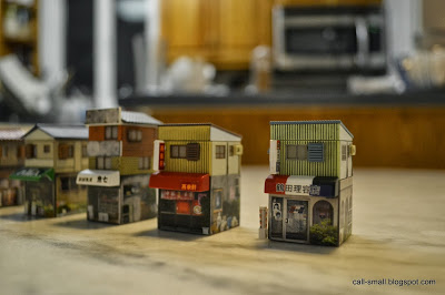
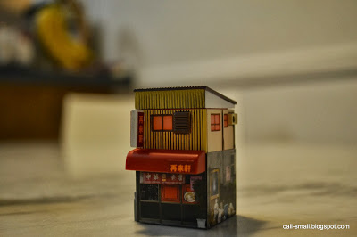
A little army of traditional Japanese houses have ended up in my house. Of course I am obsessed with them because they are supremely tiny. And so well made.
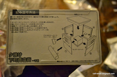
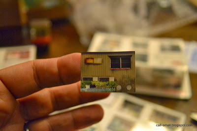
Manufactured by Takara in 2003, the houses are actually different types of commercial buildings: a Chinese restaurant, barber, candy shop, seafood shop, and general shop. They each came packaged with stickers that have photo-real imagery -- they really bring the buildings alive.
The are quite sturdy and snap easily together.
Neat, right? The Chinese restaurant even came with a bulb and lights up!
 |
| Photo courtesy of the Re-ment Addicts Flickr group |
A Dolls' House Auction: Twenty Architects Build Small
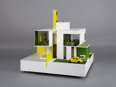 |
| Allford Hall Monaghan Morris |
I just read on daddytypes that twenty leading architects from around the world are participating in a fundraising initiative for the organization KIDS--a UK-based charity that supports children with disabilities-- by creating 21st century dollhouses that each address a disabled child's needs.
What a great project, and what incredible eye candy!
 |
| Coffey Architects |
 |
| Glenn Howell |
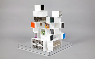 |
| Dexter Moren Associates |
 |
| DRDH Architects |
 |
| DRMM |
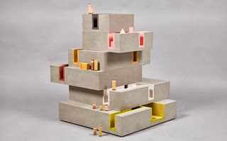 |
| Duggan Morris Architects |
 |
| HLM Architects |
 |
| James Ramsey Raad Studio |
 |
| Adjaye Associates |
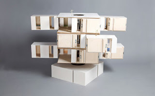 |
| SHEDKM |
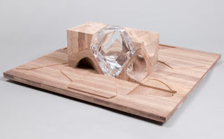 |
| Zaha Hadid |
The houses, currently up for bid, will be auctioned off at Bonhams in London on November 11. They are not cheap, people, and many reserves are not yet met.
You can read more about the project at A Dolls' House. I will continue to keep tabs on this!
Quick Impression
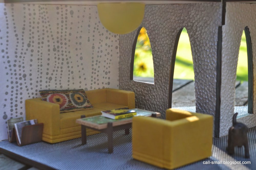
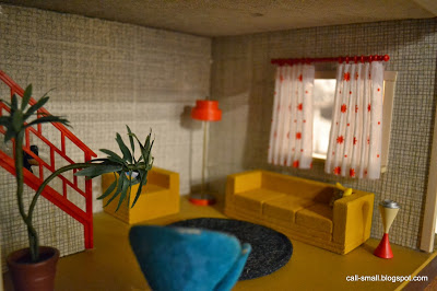
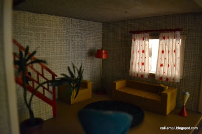
I love my vintage Brio, and gravitated to it for a setup with a new yellow flocked couch and chair set from eBay. Perhaps it is Strombecker? The scale is small...a petite 1:16.
I do love yellow...works in moody or bright light. And I had the chance to pair the new set with a vintage Brio chair received a few years ago. It's in rough shape, but I don't have the courage or heart to try and repair the blue flocking! I'd love to get one in better shape some day.
'Night!
The time it took me: 32 minutes
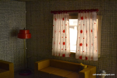
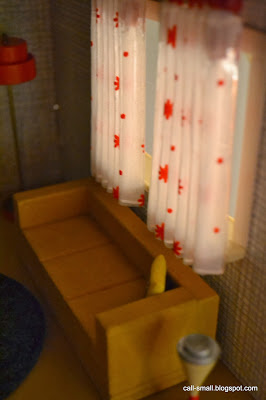
Credits: Flocked couch and chair are vintage Strombecker (?); chair is vintage Brio; plant is AG Minis; dog (he's hiding!) was a gift from my kids; lamp and curtain are Lundby; pillows are Megahouse; rug is a coaster from CB2.

