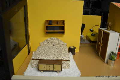
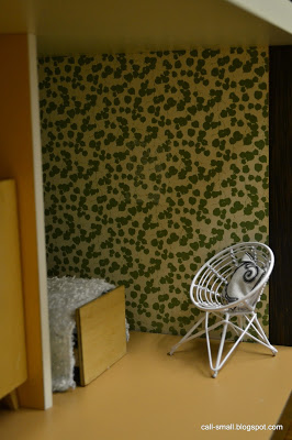
I'm Still Here


Yes, I am still here! It has been a very long time since I posted last. Life has been quite full, and I feel pulled in many different directions. Sometimes it is difficult to stop moving and take some time to "mini."

So perhaps I should alleviate the pressure of doing my usual length posts each time, and make the effort to post "bite-size" things more often. I'll try it. Can't promise I won't diverge from the plan!

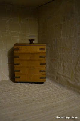
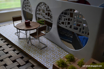
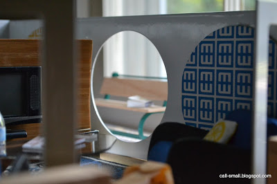
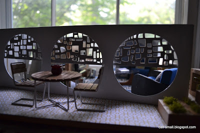
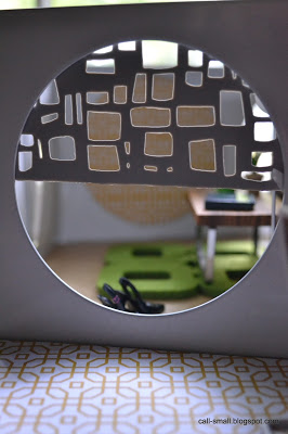
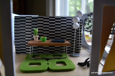
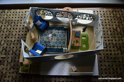
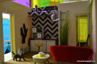
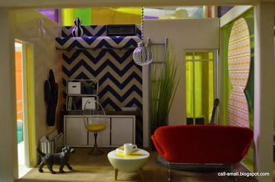
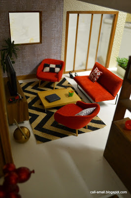
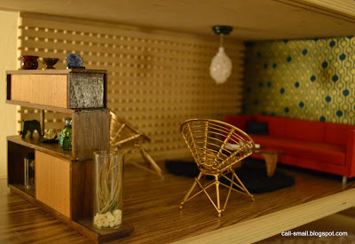
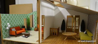
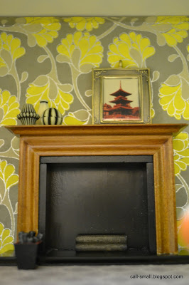
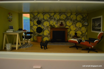
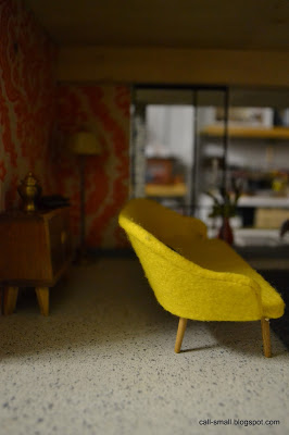
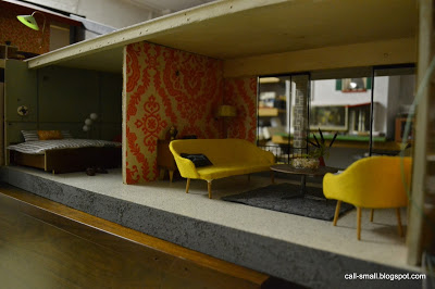
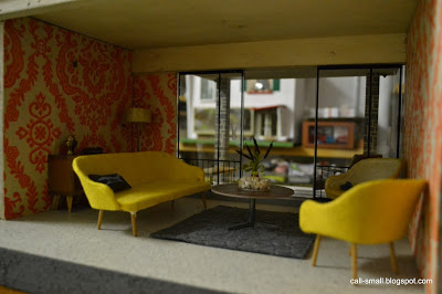
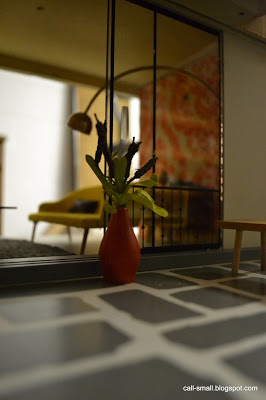
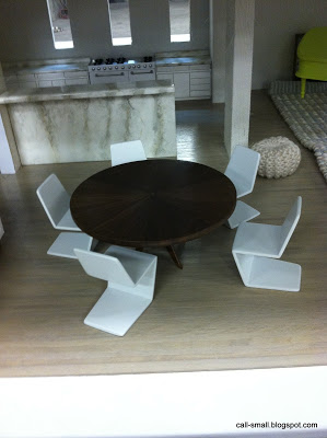
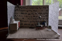
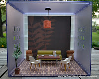
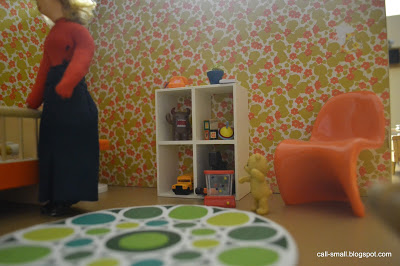
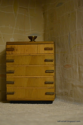
I've gotten a few new acquisitions lately, nothing major. My lack of time to blog also means a lack of time to troll eBay for various finds. I got this art deco-style dresser for a song...it looks quite at home in my Gottschalk room box, no?


'Til next time!

The time it took me: Really, no time at all!

Credits: Table is by Paul MacAlister; dresser is a vintage eBay find. Accessories are Manor House Miniatures and another eBay find.

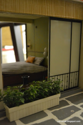
Planter House: Repurposed west elm


Sorry about the long stretch of time between posts! My non-mini life has been so incredibly hectic. It doesn't matter if it is summer...I have not had much down time at all, and any down time has been spent catching up on many different things for home, family, and work!

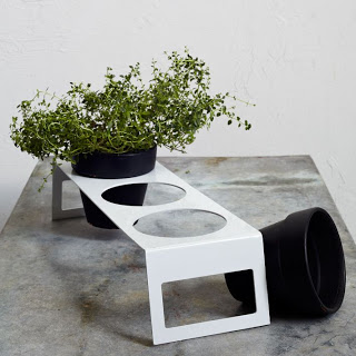
Please don't let the silence fool you, though. I have not closed my mini eyes to some new small acquisitions and finds. I'm definitely due for a clean up and organization of my collection and accessories, but until that happens, I decided to create a new structure out of a west elm product: an herb planter!

Photo courtesy of west elm
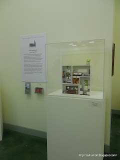
I was completely smitten upon seeing it at the new west elm store at MarketFair Mall, and it was also on clearance for less than $6! I bought two and started considering how I might use them. The whole process of putting this structure together reminded me of my repurposing experiments with tissue box covers from Crate & Barrel, where I created a mod house and a more traditional house. The latter actually ended up in an exhibit at Grounds for Sculpture, which was a lot of fun.


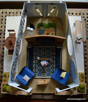
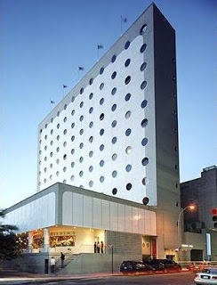
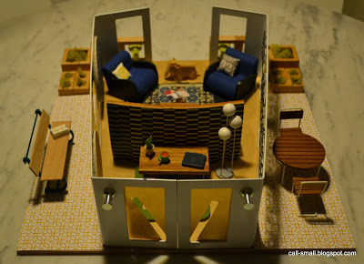
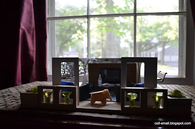
The first iteration for my west elm pieces is the Planter House. I laid the pieces on their side and then joined them together to form doors, keeping the back open. The porthole windows didn't scare me off...I have always admired the Maritime Hotel building in New York City, which was originally constructed in the 1960s for the National Maritime Union.


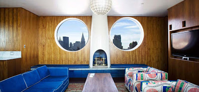
It's pretty cool, right? The hotel interior is gorgeous...check out this guest suite.

Courtesy of the Maritime Hotel
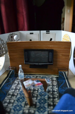
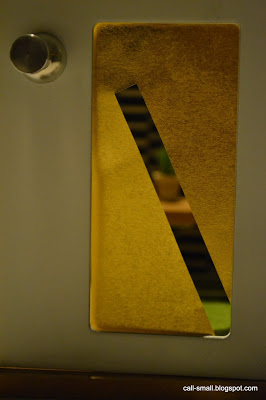
I decided to decorate my little abode as a media room, and used a range of repurposed materials: the window coverings on one side are cut up placemats by Chilewich, and the other windows have paper coasters; the wood TV wall is a clearance item from IKEA that I covered in washi tape for an accent wall; the green outdoor lights are drawer pulls from IKEA; the "sconces" by the front door are magnets; the silver box accents by the TV are place card holders; and the green carpet is a coaster.


Did you notice those great moss planters and square dividers? Those are from the new Constructures set from brinca dada. It is awesome. I first saw this new product at the Toy Fair back in February and I was eager to get my hands on a set. Designed by founder Doug Rollins, the blocks are addictive fun: you can nest and balance them, building new worlds. And of course, they are incredibly adaptable for mini use. Doug and crew are currently offering 25% off the $39 retail price, but this deal expires on August 2, so hustle! Enter code FB25CONSTRUCTURES at checkout.

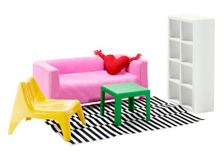
By the way, I did stop at IKEA and picked up some great odds and ends for this post, and also bought two sets of the Huset doll house furniture.
Courtesy of Design Taxi
There have been some very helpful blogger reviews--check out Snowfern's and Dragondee's--and I was curious to check out the set first hand. I share disappointment over the 1:8 scale, but the pieces are generally well-made. I love the rug in particular and the Expedit shelving will come in handy. I hope to use them soon. Let me know if you have bought the set!

Credits: Chairs are vintage German; globe light is minimodernistas; Noguchi table is PRD; front door table is by Pepper (one of her first pieces!); Eames elephant is Reac; outdoor table and chairs are vintage Lundby; bench is a eBay find; rug is a doll house show find; planters are Constructures by brinca dada; outdoor "tile" is scrapbook paper and door inserts are cut-up origami paper. Accessories are Re-ment, Manor House Miniatures, The Shopping Sherpa, Barbie, Nancy Tobin, AG Minis, and My Mini Mod Pod.

The time it took me: I labored over the layout and design over a period of a few weeks--I lost track!

Nautical


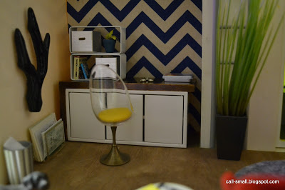
I had every intention of creating a "modern nautical" scene, inspired by some lovely marine blue chevron paper from the Paper Source, but not sure I succeeded. The vision was different in my head and I don't think I quite articulated it. I had bought some cool ocean life pushpins on clearance (white modern sand dollars, starfish, and seashells) and was convinced I would use them here somehow, but it just didn't work, and things fell off into a different direction. Does this ever happen to you? Please tell me it does!


In any case, it was lots of fun to put together!

By the way...if you like following this blog and do it via Google Reader, you now need to follow me using a different reader such as Bloglovin' or Feedly since Google Reader is kaput as of today, July 1. If you use Blogger like I do, your dashboard will still work as a reader for the blogs you follow, but you still might look into an alternate reader. I signed up for Bloglovin' and it was a quick click of a button to move all of the blogs I follow over to the new reader. See you there!!

Credits: Couch is vintage Brio; side table is Re-ment; office chair is Petite Princess; desk is brinca dada; plant is Playmobil; rug is a coaster from Crate & Barrel; circle wall art are also coasters that I picked up in Palm Springs; light is a pull chain from Lowes; wall covering is from the Paper Source, as is the flooring. Accessories are AG Minis, CB2, Re-ment, Barbie by Jonathan Adler, ELF Miniatures, Michaels, Manor House Miniatures, and Nodameggakki.

The time it took me: 57 minutes


Adhesive Washi Paper


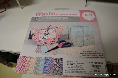
I would definitely file myself under "obsessed" when it comes to washi tape. I've used it many times over the years, in a bath scene, for swaps, in an office, and in many other cases. I collect it like crazy. So, of course I picked up a stack of the new adhesive 6 x 6" sheets when I saw them in the Paper Source this weekend. (I had seen 12 x 12" sheets at the NYIGF in January, so I have been waiting for them to show up in the stores.)


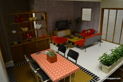
At $12.95 for 20 sheets, it's not cheap, but I'd say it is worth it to get all inspired by the patterns and possibilities. I also picked up some chevron burlap and a scene was born. In addition to covering the back of a couch and the dining table, I used some tape as a rug border. I easily gravitated to the red as a complement to the chevron burlap.


The paper is very easy to manage and cut, although a word of advice: do not pull it off the sheet too quickly, as it can curl and stick back onto itself. It comes off quite cleanly from objects, so you can remove it, as long as it is not adhered too long, i.e., months. Of course, please choose smooth surfaces, and no paper.

Here are a few more shots from my washi workout!


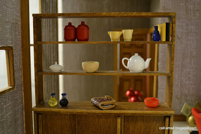
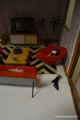
Credits: Dining table and red chairs are vintage German; dining chairs are eBay finds; shelving unit is a dollhouse show find; long planters are TOMY; standing plant is AG Minis; TV credenza is by Cyd of My Mini Mod Pod; coffee table is PRD; red balloon dog is from Toy Tokyo; chevron burlap is from the Paper Source; dining rug is textured paper from JoAnn Fabrics. Accessories are Manor House Miniatures, Barbie, Re-ment, Michael's, vintage German finds, Hallmark, The Shopping Sherpa, Lilu Shop on Etsy, Crate & Barrel, and minimodernistas.

The time it took me: 1 hour, 10 minutes


Villa Sibi, Twice


I really hope that I am not the only one out there who decides that she cannot fully harmonize a room setting, and then creates two different scenes in one.

It's frustrating on the one hand, because I feel like I failed at a unified interior, but then kind of challenging and fun on the other hand, because I end up with a creative solution that I am generally happy with...at least temporarily!

Question: Could the same person/people live here???


I'll let you decide :)

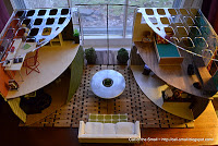
Credits: Couch is minimodernistas; wall covering is Paper Source; Noguchi table is PRD; fixture is vintage German, as is the table on the deck; gold chairs are CB2 ornaments, spray painted; shelving unit is Minisx2 on Etsy; chairs are an eBay find; side table and long farm table are doll house show finds; house wall art is from JoAnn Fabrics. Accessories are Re-ment, AG Minis, dollhouse show and eBay finds, toHold on Etsy, Megan of Modern Mini Houses, Jazams, Bodo Hennig, Dragondee, and Cyd of Mini Mod Pod.

The time it took me: 57 minutes, mostly due to extreme indecisiveness!!!

Artply Highland Update


I love when I am able to share a renovation update on one of my houses. Makes me feel like a less neglectful parent! :)

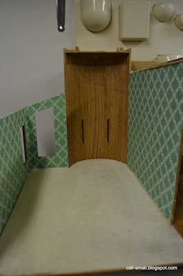
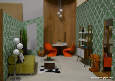
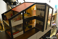
My Artply Highland patiently sits in my work room and I have been tinkering with it since I got it over a year ago when I bought it on Craigslist for a cool $20. I have renovated one room so far, but it does need lots of TLC. I really cannot tolerate the muddy brown color of the exterior and hope to paint it soon (any color ideas? send them my way!). I took off one of the roof pieces to gain better access to the top room with the lovely rounded wall. I had been looking for wallpaper for quite some time; I knew I wanted a bold pattern, like the room I renovated next door, and was leaning toward a green or creme. I then found this Lokta design from the Paper Source, and was confident it would do the trick.

First, a view into the space, which I dubbed the "Mickey Mouse room" for obvious reasons:


Ugh...

Once I put the Lokta paper on one wall, I realized that I needed to break up the pattern with the curved wall. I liked the dark shade of the existing wood wall and decided to experiment with a 12 x 12" birch sheet, also from the Paper Source. I had a walnut colored paint marker and tried out the hue.


I liked the combination and painted the whole sheet. I also cut out long holes for the windows. I did not permanently adhere this piece since I might be able to completely scrape off the Mickey Mouse papers and show the original wall.

The remaining Lokta paper fit nicely on the other side, and the room was done!


I do not like the carpeting, but I did not have a good "cover up," so I left it for now.

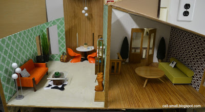
It was fun to try different pieces of furniture in the room, but I couldn't decide on the couch: orange vintage Bodo Hennig or green "tootsie roll" by Minimodernistas. Do you have a preference?


As I was finishing this work tonight, I finally got around to opening today's mail and was surprised by a lovely little envelope. Inside was a gorgeous handmade metal firescreen by the amazing Fran of Fran Made Minis. She thought the fireplace in my most recent scene was lacking proper flowery coverage and remedied it with this!


I love it -- thank you so much for your thoughtful gesture, Fran!

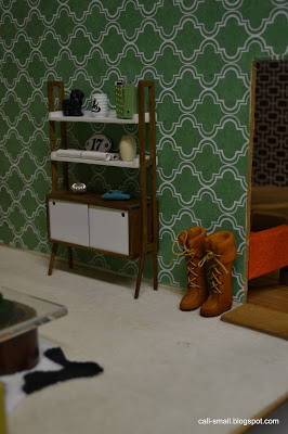
Credits: Round table, Panton chairs, and orange couch are all Bodo Hennig; green "tootsie roll" couch and both globe lamps are Minimodernistas; shelf is by PRD Miniatures; coffee table is comprised of a napkin holder from Crate & Barrel and an acrylic block; cowhide rug is by Oese; flower pot is Playmobil with an aquarium plant. Accessories are Re-ment, JoAnn Fabrics, AG Minis, Michaels, The Shopping Sherpa, Minimodernistas, and Crate & Barrel.

The time it took me: 42 minutes, not including the wallpapering!

A Mess of Flowers


Flowers have been on my mind lately. First, I received some lovely ones for my birthday earlier this month from three different people, all different versions! They are currently brightening up my office, and I hope I can keep them alive.

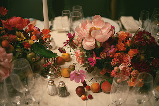
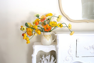
My other flower musings have been related to Amy Merrick, a New York City-based florist and stylist who does gorgeous work. I love looking at her Instagram feed, reading her blog, and hearing about her latest projects, like doing the flowers for the recent celebrity-studded dinner for the Punk fashion exhibition at the Metropolitan Museum! She is truly an artist and I find her photos very calming and inspiring.


(Photos from Amy Merrick's Flickr stream)

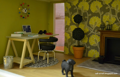
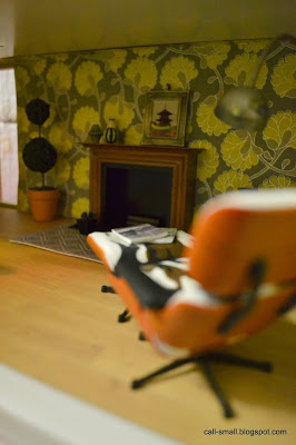
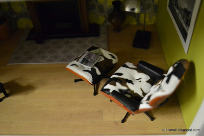
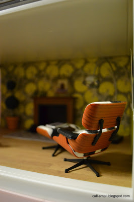
All this flower exposure prompted me to use some beautiful heavy-weight "Flurry Sunshine" paper from the Paper Source in  my Lundby Stockholm. This also gave me the opportunity to use my new minimodernistas ball clock, given to me by a dear friend (another birthday gift!), as well as a cowhide-print Eames chair, a blind box purchase on Mother's Day at Toy Tokyo. The black-and-white artwork by the chair is a miniature photograph from my work colleague K., who knew I'd find a use for it :)


Here's to flowers!

Credits: Desk is by Dragondee; chairs are Reac; plant and wastebasket are AG Minis; vase is a dollhouse show find; arc lamp is an eBay find; grey rug and magazines are by The Shopping Sherpa; dog is Schleich; desk rug is a coaster; ball clock is minimodernistas. Accessories are Michaels, Re-ment, Toy Tokyo, and AG Minis.

The time it took me: 34 minutes

A Detour Down Pinky Street


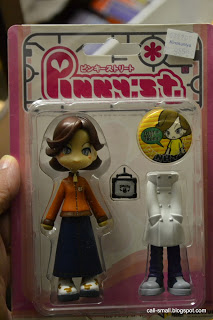
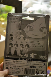
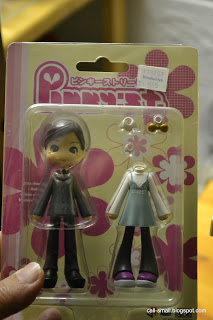
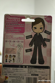
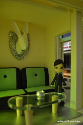
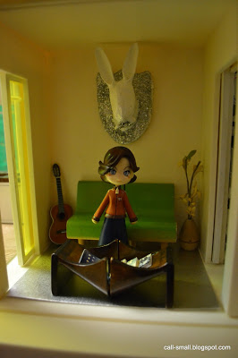
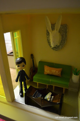
I am guessing that some of you out there are familiar with Pinky Street dolls, made by Baby Sue and Vance Project of Japan since 2003. Pinky Street dolls have a huge, enthusiastic following. At four inches high, they are best suited for 1:18 or 1:12 environments, and have interchangeable parts that you can mix and match to make hip figures with street cred. I first saw them in modern doll house scenes on Altera's blog a few years ago (I miss your posts, Altera!), and I thought they were adorable. You can see them in action on her blog here, here, and here.

To learn all about Pinky Street gals, pinky-street.com is a great resource.

Now, I am generally not a doll person...my scenes are usually uninhabited. But, when I saw two Pinky Street dolls in the Kinokuniya book store in Los Angeles in March, I bought two! They were $10 each, and had some charm. I finally got around to taking them out of their packages for their maiden voyage to the Kaleidoscope House.

Introducing...


and


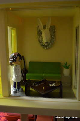
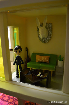
I set up a few different scenes with 1:12 and 1:18 scale pieces to see what might work best. I think 1:18 is a better scale...these are petite gals!


The Pinky girls split!
Hope you enjoyed my little detour down Pinky Street!

Credits: Diner benches and clear side table cube are by AG Minis; kidney shaped table is Ryan's Room; green chairs are Creative Playthings; rabbit head is a Christmas ornament from Anthropologie; planter is Manor House Miniatures; plant is Playmobil; flooring is origami paper; pillow is by Megan of Modern Mini Houses; coffee table is made of two kitchen stools by brinca dada, turned on their sides; guitar is Nodamegakki. Accessories are AG Minis and Lilu Shop on Etsy.

The time it took me: 32 minutes for all the set ups

VERO Seeblick: Sea View


Another VERO dollhouse has captured my heart! It's hard not to be charmed by a VERO. I already have two: a 1966 beauty and a mod, two-story early 1970s one. I've had my eye on the lovely one-story "Seeblick" or "sea view" for quite some time, and when Annina put hers up for sale, and I could not resist. It's a bit beaten up, but still has wonderful life and karma (Annina is such a talented miniaturist, stylist, and photographer).

It's an insane purchase, since I literally have no room for it. I managed to clear off some space adjacent to my Bodensee in order to put it together. As Rebecca noted in her post from a few years ago, you need to be an octopus to get it all screwed together! I struggled and dropped the tiny screws more times than I can count, but it finally came together. I took some quick first shots after setting up a living room and bedroom. One day, I will bring it upstairs into natural light for some better images and backdrop.

Until then...


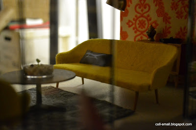
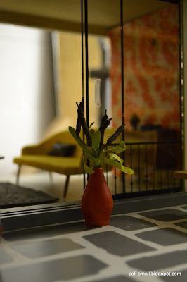
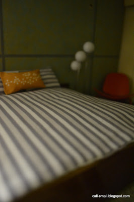
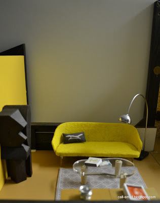
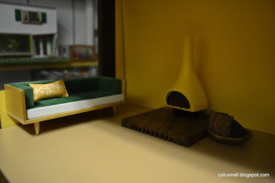
Credits: Chairs, couch, bed, footstool, and sideboards are vintage German; coffee table is vintage Brio; outdoor chair and Arc lamp are eBay finds; green rug is a felt coaster; bedroom chair is Reac; globe light is minimodernistas; bedding is by The Shopping Sherpa. Accessories are Re-ment, dollhouse show buys, made by Dragondee, and TOMY.

The time it took me: 52 minutes (not including assembling the house!)

Sneak Preview: Custom Designer Dollhouses


There has been a ton of happy, excited buzz in the dollhouse/miniature community (especially among us modern fans) about the forthcoming Kaleidoscope Ball auction to benefit the Mattel Children's Hospital at UCLA, specifically its Children's Discovery and Innovation Institute. The reason?

TEN. CUSTOM. DESIGNER. DOLLHOUSES!

That's right, TEN custom creations--spanning styles from modern to Italianate--as imagined by some of the country's leading interior designers, architects, and landscape designers. The houses are mammoth in scale, and measure roughly 6 x 3'. You can read more about the auction, designers, and other background on Mini Modern and Modern Mini Houses.

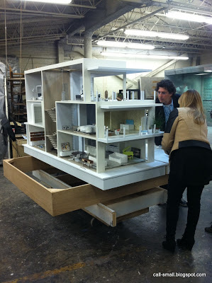
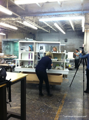
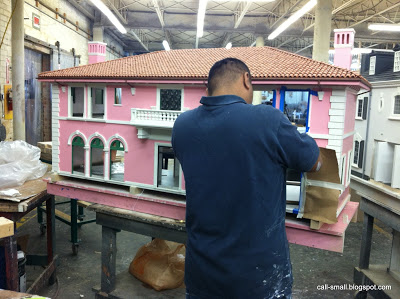
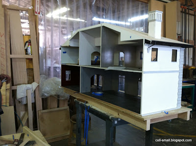
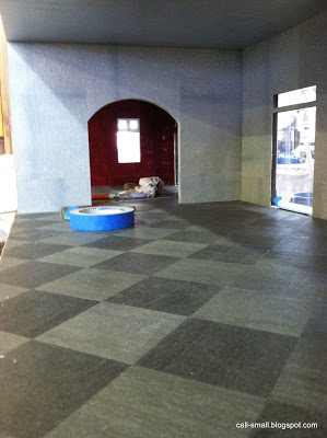
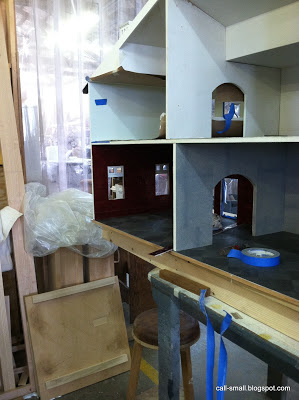
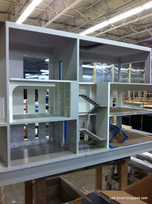
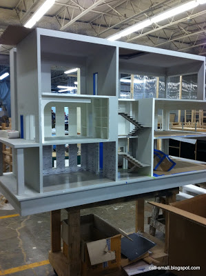
I traveled to Los Angeles on spring break with my family and *really* wanted to squeeze in some dollhouse time and get a sneak preview of the houses. By some miracle, it worked out! On Friday, I visited the warehouse of where all the houses are being fabricated. There were five houses on display, in varying states of completeness. Each of the houses was designed by Richard Manion and Robert Meiklejohn of Richard Manion Architecture.

The house that is farthest along is the "Contemporary Beach House Two," with interior design by Chris Barrett and the team of Ron Woodson and Jaime Rummerfield


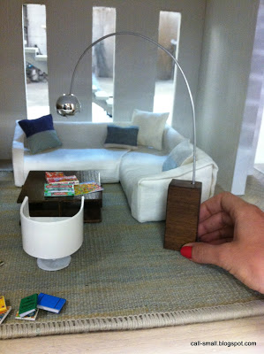
She's a beauty, eh? The craftsmanship is amazing and the designers are putting some nice touches on the airy spaces. The furnishings were lovely, and came from a variety of sources. I immediately noticed gems by Paris Renfroe, minimodernistas, and ELF Miniatures, and then some pieces that were either made from scratch by the woodworking shop, or were re-imagined with new parts, like this dining table and this Arc lamp -- both were re-fitted with new pieces.


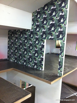
It was also cool to see pieces that were being painted, sewn, polished, and fitted for the houses.


While I was there, I met Chris Barrett and Jaime Rummerfield, and enjoyed seeing them work. It was interesting to observe the challenges that they were encountering (how to style that huge entertainment unit??), as well as see the obvious fun they were having designing these small spaces. They pointed out the custom modern artworks they created for the house, inspired by the work of Cy Twombly and Franz Kline, and they also accessorized the spaces with sculptures and other objects.


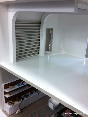
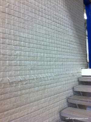
It was great to see such creativity and inventive use of materials, such as the glossed marble wallpaper and the steel door for the garage!


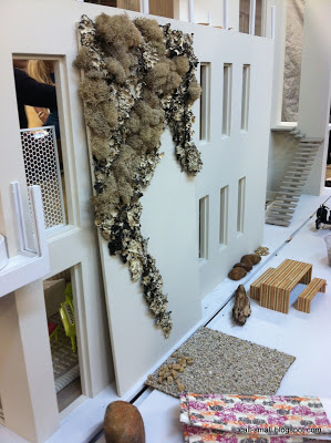
I also met Stephen Block, who was there working on the landscape design for the beach house. Here's his living "mood board":


He also spoke about the challenges of working so small, but deriving a lot of satisfaction as it continued to evolve. Here's a quick video of some behind-the-scenes work on the size of the property on the back of the house.


I cannot wait to see how it turns out!

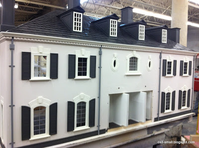
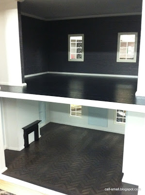
There were four other houses in the warehouse that were getting ready for their closeup.

The Italianate House One (Lonni Paul and Adam Hunter)


Lovely stairwell! And that table...!


The Italianate House Two (Mark Cutler and Cari Berg)


The Georgian House Two (Tim Campbell)


The Contemporary Beach House One (Jeffrey Alan Marks and Elizabeth Dinkel)


There were five houses not on display: Modern House One and Two (sad not see those!); Georgian House One; Brownstone House; and Monique Lhuillier NY Flagship Boutique.

I am told that $20,000 is the expected price for each of the houses. Some of the houses will be available for bidding at the Kaleidoscope Ball auction on April 17, whereas others will be sold in a special charity sale on One Kings Lane. All proceeds for both sales will benefit the UCLA/Mattel Children's Hospital Children's Discovery and Innovation Institute.

Hope you enjoyed this little preview! I look forward to sharing more!

Texture


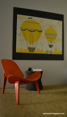
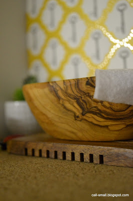
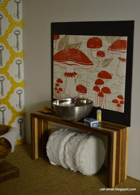
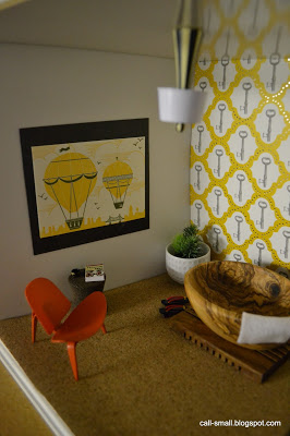
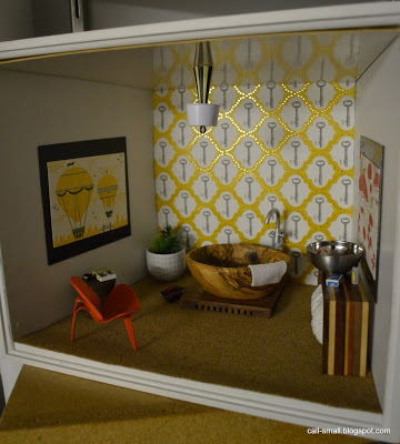
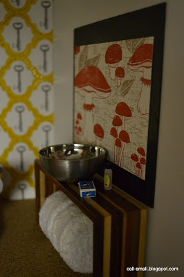
Texture's the thing here...it motivated me to use letterpress illustrations (cut from a 2011 desk calendar from the Paper Source), and a new sheet of DCWV scrapbook paper for a lemon yellow and gray backdrop. The flooring is adhesive cork, which has a nice but subtle texture. The "tub" is actually an olive wood "nibble" bowl from Crate & Barrel--textbook texture!


Credits: Tub, platform, and planter are all repurposed items from Crate & Barrel; console is PRD; chair is Reac; side table is miniatures.com; towels are Lundby; sink is a swap from Oese; fixture is Barbie by Jonathan Adler; artwork is Paper Source. Accessories are Re-ment, AG Minis, and dollhouse show finds.

The time it took me: 22 minutes

Vinyl 1970 Mod Playhouse by Ideal


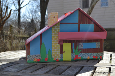
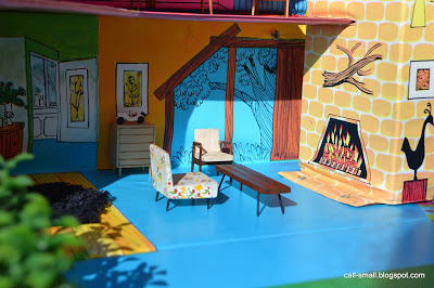
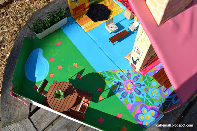
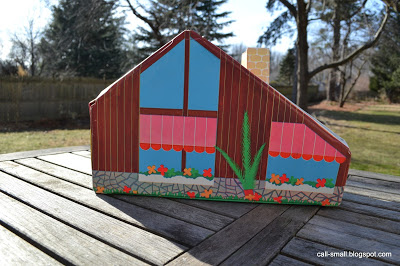
It is sunny and feeling like spring, so I decided to take a new mini acquisition outdoors. This vintage vinyl playhouse, made by Ideal in 1970, made its way into my collection for $22, purchased on eBay.

I wasn't looking for this type of house, and I don't imagine I will use it that often, but it is a cool piece of history! In terms of scale, I'd say it is closest to 1:24. My Lundby furniture was too large (except I did leave the patio set), so I used my Paul MacAlister pieces.


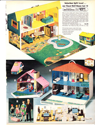
The house was advertised in the 1970 Sears catalog as "Modern House with Fireplace" and sold for $5.99. It came with a set of molded plastic furniture (looking very much like Petite Princess), and a family was sold separately.

Courtesy of wishbookweb, p. 575 of Sears 1970 catalog
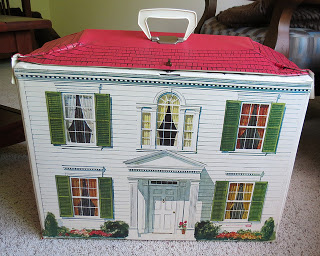
Ideal made a range of vinyl houses in the 1960s and 70s, such as the traditional "Colonial Mansion," made for the Petite Princess line of furnishings:
Photo by Gina2424
You can see more Petite Princess eye candy in this Flickr group pool. One contributor to the pool even made a 1:144 scale version of the vinyl house!

Photo by Vixie Vaporous
It looks like Ideal made other versions of the Modern house, like this one currently up for sale on Etsy:


I'd say it's more psychedelic than mine! Do share if you know anything more!

Credits: All the furnishings are by Paul MacAlister, with the exception of the TOMY planter and Lundby patio set. Accessories are Re-ment and dollhouse show finds.

The time it took me: 33 minutes

NYIGF and Toy Fair


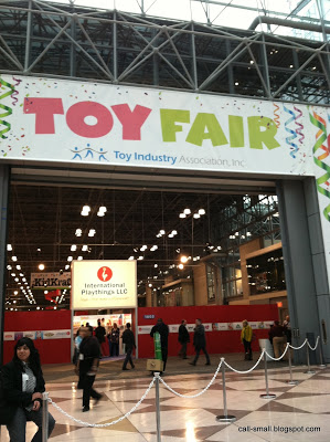
Once again, I attended both the New York International Gift Fair (NYIGF) and Toy Fair at the Javits Center in New York City in January and February, respectively. I register as press (yes, because of this blog), which means I can access press releases and other information about new products in advance and then review other material on site in the press center. It also means I get emailed a lot by PR firms and companies themselves...sometimes it is relevant, other times not!

NYIGF, which will be known as "NY NOW, the Market for Home & Lifestyle" with the August market (August 17-21, 2013), includes home and housewares as well as the newest in design and handmade items. The Toy Fair is the showcase for the toy industry, so it features all the major companies as well as smaller, independent toy makers and innovators.

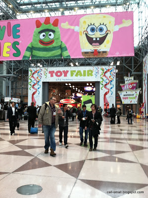
I first attended the shows back in 2011, with an eye toward modern dollhouses and anything that might be repurposed for modern miniature environments. The shows are high energy, usually crowded, and filled with a dizzying array of products. And giant product placements!


Each exhibitor has a booth -- some are quite small and open, whereas the larger companies have much more expansive spaces with walls on all sides and elaborate entrances. You can't really call them "booths" anymore...more like fortresses.

See?

The shows include *hundreds and hundreds* of vendors across many categories, so it is a bit overwhelming. This time around, I decided to be systematic: I made appointments with a few companies in advance and mapped out my visit according to booth numbers (each show provides massive directories with company names and booth numbers) I only had a day to spend at each show, so I wanted to structure part of my visit and then be able to freely walk around for some "discovery" time.

As always, I like to share highlights of my visits, especially any news and products. I've combined both visits here in one post, so lots of photos ahead!

Shall we start with brinca dada? Why, yes!

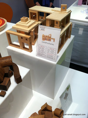
It was great to see Doug (Rollins, CEO) and Erica (Turzak, COO) again. The "Zoe" house was on display (it's selling very well, Doug said), and while there is not a new dollhouse on the horizon, there is a new line of blocks, "Constructures," that are extremely cool and show lots of promise for adapting in the modern miniature realm.

Hi, Erica!


Nice, right? The set will include forty pieces and will retail for $39.95. Look out for them in April!

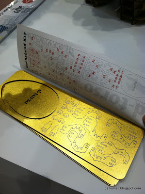
On  I went to the d-torso booth, which featured a line of 3D constructions made by a Japanese company, AKI. Many animals were on display, and are intriguing for 1:12 scale play.


The packing is neat as well...


While I didn't see it at the show, the company makes a mini deer head. Possibilities!

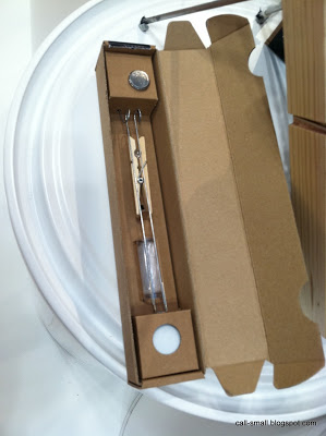
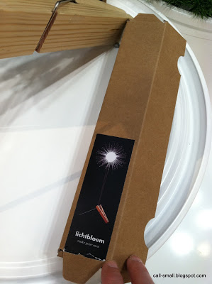
Next, I was drawn over to a small display showing Lichtbloem, a DIY light by Coens made of a ping pong ball, optic fibers, LED, and a clothespin!


Very cool Dutch design, no? Could be adapted for a mini space for sure. It will retail for approximately $25.

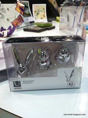
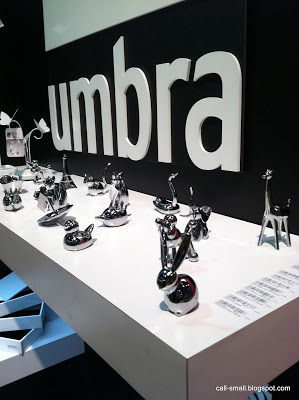
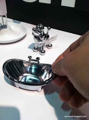
As always, UMBRA offers fun and functional eye candy. Ring holders are definitely transferable to a mini environment, as are magnets, and their plastic mats might also work well as flooring or dividers.


In addition to housewares, the NYIGF is a venue for card and stationary companies. I love seeing the range of creative designs...I could spend hours just looking through papers and other accessories. I saw a few neat things, such as...

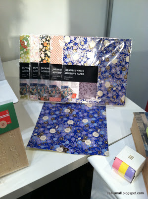
Adhesive washi paper! Retails for $11.95/five sheets


Animal-shaped stick-it notes!


And paper bots!


YAY!

I was running by the Vigo Cards booth and didn't have time to stop, but saw some gorgeous flat papers. Here's a few images from their blog.

Alexander Girard line

by Papier Peint

by Debbie Powell

Lovely, eh?

On to dollhouses!

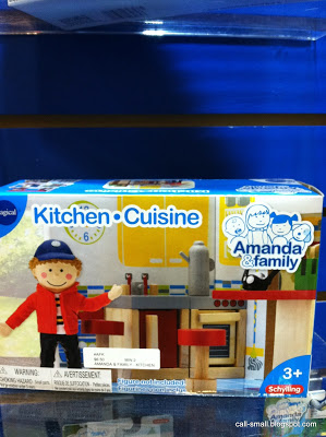
At Schylling, I saw a kid's house called "Amanda & Family"


Photo courtesy of Schylling website
Shows some promise for mini play, and has a durable wooden construction. Retails for $49.95.

What do you think?

Hape was a highlight! I made an appointment to see the latest line of dolls, and also hear more about Hape's acquisition of the venerable doll maker Kathe Kruse. Both companies have such a long and distinguished history, and are uncompromising in their production of high-quality products. Seems like a powerhouse partnership! I am curious to see what will be next.
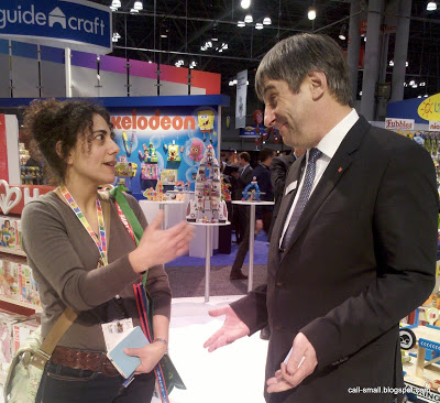
That's me chatting about the Kruse acquisition with Peter Handstein, Hape Founder and CEO 
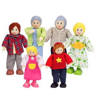
The Hape booth had on display some adorable new wooden dolls, which represent a departure from their previous dollhouse people line, "Happy Family," which looked like this:

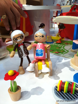
And now, they look like this:


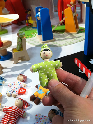
The line is very cute, modern, and fun. The dolls will retail for $7.99. The babies, which will retail for $2.99 each, are totally adorable and could easily work in a modern mini environment.

Hape also let me know that plans are now in the works to update the phenomenal Sunshine dollhouse. I hear there may be a new layout and furnishings!
Cannot wait to hear more on that!!

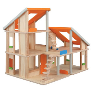
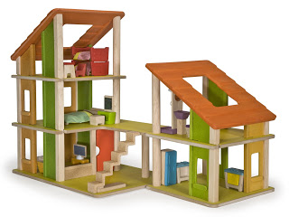
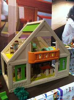
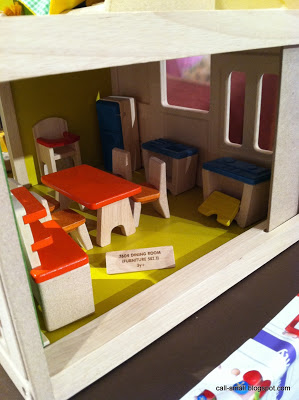
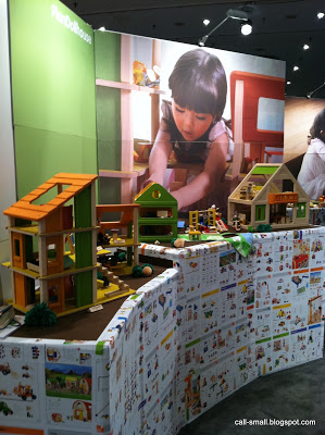
Plan Toys always delights too. They have come out with a new Chalet Dollhouse and My First Dollhouse which look similar to the original, but are made of replenishable rubberwood material.

Here are the originals:
Photo courtesy of Wayfair.com
Photo courtesy of Amazon.com

And the new!


Love the colors and textures! Definitely tempting to get one.

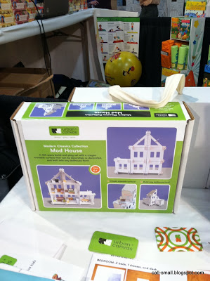
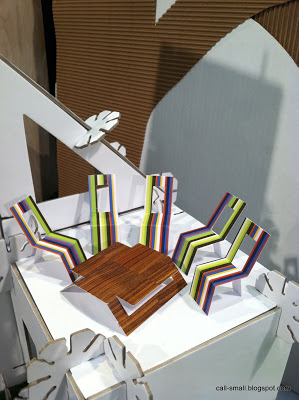
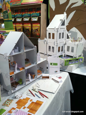
Moving from sustainable wood to...cardboard! I was delighted to come upon Urban Canvas, which makes a neat modular cardboard dollhouse called Mod House. The designer and owner, Maria Chee, wanted to create a fun and different structure that also had a strong element of reuse and creativity. The walls are a blank canvas for designs, and can be easily written-upon and erased. You can also explore different configurations for the house.


Neat, huh? The house set retails for $55 and includes the furniture too. Would you buy one?

WHEW! I hope you enjoyed my report on both fairs. I go back to the summer market of NYIGF in August, so more to come then!

WallPops! Featuring Jonathan Adler

OK, I am in love. 

You've probably caught drift of an ongoing trend in 1:1 scale design over the past few years -- wall decals -- but I cannot say that they have taken hold of the world of modern miniature design. It has occurred to me in the past to try to adapt decals for scenes, but the scale of the prints never seemed right (mostly too large) and they generally were not aesthetically appealing (too childlike or too ho-hum).

Until now...!

One of the highlights of my visit to the New York International Gift Fair (my review of NYIGF and Toy Fair is forthcoming) was the WallPops! line of decals, especially their collaboration with Jonathan Adler. I was blown away by the bold, gorgeous prints, and knew that I could use them in modern mini environments.

I tried the "Santorini" Stripe roll, which measures 6-1/2" wide and 12' long and retails for $17.99.


I chose my Kaleidoscope House for this scene, thinking that the plastic panels would make for a smooth backdrop. The roll has an adhesive backing that is REMOVABLE -- yes, it did easily peel off without any residue or damage -- and they are very easy to cut to size, apply, and smooth down.

The room is transformed into a chic, mod (shoe) den! I even was inspired to use some of my gold Deco Tape on the ladder, to help integrate it more in the room.
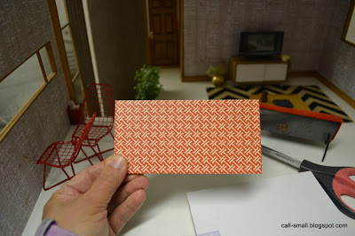


I see a lot of uses for WallPops! for modern dollhouses and room boxes, and it is nice to have a creative alternative to scrapbook paper. In addition to the rolls, there are coordinating designs that come in "dots" (13" in diameter) and "blox" (13" x 13" sheets), so you could easily adapt them for flooring, wall paper, and ceiling decoration. I would not recommend applying WallPops! over existing wallpaper, but plastic or wood walls would work well. Regardless, I do recommend testing a small, inconspicuous spot of the surface to ensure the decal easily peels off.

Thanks, WallPops!, and please let me know if any of you decide to take the leap into decals!

Credits: Daybed is Reac; sideboard is vintage German; vase is a dollhouse show find; flooring is Indian Embossed Pebbles paper from Kate's Paperie; globe light is minimodernistas. Accessories are Barbie, Re-ment, and AG Minis

The time it took me: 2 hours (I fussed over furnishings, even though it ended up being pretty minimal)


Hightstown Miniature Show: 2013

The priciest piece--I negotiated down to $15.

The Hightstown Miniature Show in Hightstown, N.J., was on Saturday and I was able to run over for 1-1/2 hours. It's quite ideal: small (it's held in a church activity room), fifteen minutes from my house, nice people, and not a lot of vendors (maybe twenty or so). The drawback is that the wares are overwhelmingly traditional, but as with my visit last year, you can find some vintage gems and other treasures from the $1 bin!

My spoils are in the following photos. I probably did five or six laps around the room, making sure I hit each vendor. I spent more time at some than others, and often found things on my second or third round that I didn't see earlier. Read the captions for more detail!
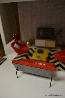
I hope to use some of these pieces very soon!
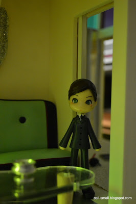
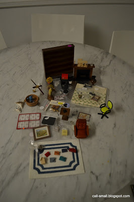
The whole lot! I spent less than $75
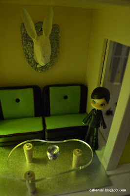
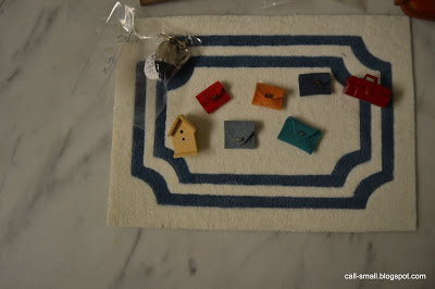
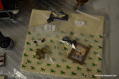
Neat rug with some handmade purses, a tool box, birdhouse, and a fancy decanter.

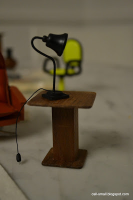
I have a feeling this light will come in handy.

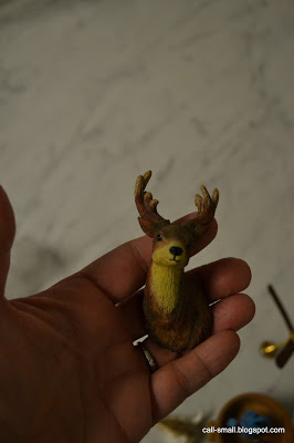
A reindeer head came home with me, even though the seller dropped him as she was wrapping him! We glued him on the spot and he's ready for his closeup.

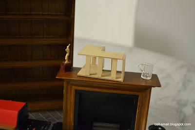
A fireplace and a few knickknacks will likely come in handy. Not sure what the wooden piece is, but it looked like a modern house to me! 

Vintage fabric, a moose painting, fancy gloves, and some accents caught my eye. 

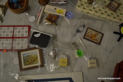
More stuff...

A wooden shelving unit will always come in handy!

Good for rain!

Cute placemats!

The find of the day: a Lundby "Brasilia" office chair, which I have been looking for to match my other Brasilia pieces: it was $5!!!!

This was one of the more unusual finds of the day.

I still think this could work as a modern dollhouse in a dollhouse!
Hit any fairs lately? Any coming your way? Be sure to share your spoils!

New Shoes


This is one of those scenes completely inspired by a Re-ment purchase. It has certainly happened before and will happen again!

This time, it is #5 from the "Department Store Shopping" set, which includes a Louis Vuitton-style pair of shoes, suitcase, datebook, and pen with case. All very realistic!


Obviously, there's lots of brown going on here, so I chose a masculine paper to complement the pieces, and accessorized the room from there. I like this little spot in the Bodensee -- a nice corner room with a view!


By the way, if you are interested to see Re-ment sets compiled, Renatta has developed a wonderful resource at her webpage, iamneverbored. Go and have a look!

And...if you are looking to purchase Re-ment, Jane of Harapekodoggybag has an amazing selection and her prices are fair, even with shipping from Japan. The quality of her pieces is pristine, and she has many older, discontinued sets. Warning: you will buy something!

Stay tuned for my recap of the New York International Gift Fair and the Toy Fair! Posting soon!

Credits: Chairs are Bodo Hennig; table is Petite Princess; storage unit is vintage German, likely VERO; Rug is a cut piece of embossed felt from Michaels; light is vintage German; planter is by Lene of Dragondee Modern Miniatures; wallpaper is scrapbook paper from DCWV "Downtown Loft" stack. Accessories are Re-ment, Petite Princess, AG Minis, and random dollhouse store finds.

The time it took me: 42 minutes

My Collection


I've been asked many times: how many houses do you have in your collection?

I usually stumble, mainly because I have not compiled them in one post to date. It seems like such a simple thing, considering this hobby entails some level of attention to detail, but...

The Shopping Sherpa compiled all of her houses into a resource page a few years ago when she was preparing for an exhibit of her houses, and this has inspired me to do the same. I often go an drool over her houses and it's nice that they are all accessible for quick viewing!

I decided to create this post and I can add to it when new things enter in my collection. I will put a link on the sidebar of my blog too so that it can be accessed by the curious.

Hope you enjoy my little tour...

Here are my dollhouses in rough order of acquisition, beginning in 2008. I included the year of production--or the closest approximation--for each structure, and I have hyperlinked to the first post on the house. I also note if the house is made from a kit or was a scratch build from plans; if there is no notation, then the house was built by the manufacturer or required assembly.

Please note that I have grouped room boxes, fold away/pop up houses, and vintage school rooms together in one category after the collection listing.

Call of the Small Collection

1. Villa Sibi, 2004


2. Lolly's Citadel, 1980s (kit)


3. Sylvanian by TOMY, early 1980s


4. Lundby Stockholm, 2005


5. Kaleidoscope House, 2001


6. VERO, early 1970s


7. Large VERO, 1966


8. BRIO, 1966


9. A-Frame by Whitman, 1978 (kit)


10. "L" Ranch by Marx, 1953


11. Smaller Home and Garden by TOMY, 1980


12. Bungalow by Haefner & Krullmann, early 1960s


13. BRIO Chalet, 1963 SOLD in October 2014


13. Betsy McCall House, 1950s (build)


14. Highland by Artply, 1980s (kit)


15. House by Moritz Gottschalk, early 1960s


16. Contemporary Dollhouse by Doll Domiciles (under construction), 1970s/80s (build)


17. Bodensee by Bodo Hennig, 1981


18. Seeblick (Sea View) by VERO, 1960s


Room Boxes, Fold Away/Pop Up Houses, Smaller Scale Houses, and Vintage School Houses

IKEA Room Box, 2010


German School Room, 1960s  SOLD in January 2015


Fold Away Dollhouse, 1949


Instant Dollhouse by Winthrop, 1960s


Crate & Barrel Room Box, 2010


Fish Condo by UMBRA, 2010


Lil' House Wonderfull, 1981


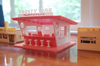
Plasticville Structures, 1950s


Room Box by AG Minis, 2000


School Room by Bodo Hennig for F.A.O Schwarz, early 1960s


Tissue Boxes by Crate & Barrel, 2011


Room-in-Miniature Room Box and Furniture by Miner Industries, early 1960s


Cadet Room Box, 2011


Neville House by CB2, 2011


Rad Pad, 2011


Epoch Play House, 1973


Lekman Box by IKEA, 2000s (?)


Jennys Home, 1965


Ben Holiday House by CB2, 2012


Vinyl Modern House by Ideal, 1970


Blue Box House, 1980


Loft to Love, 2015


Anyone have their own mini resource page for their collection?

Dollyhome Furniture by Child Life Toys

Here's a little piece of 1950s dollhouse history to share! It is always great to find vintage pieces in their original boxes, with directions or other literature. You step back in time and get a feel for what it might have been like to open them new. You also get a window on information that might be lacking (for yourself or others), and may even solve a mini mystery!

As I was writing this post, I reminisced on some of my favorite "original box" moments:
Rooms-in-Miniature by Miner Industries

Keystone Village Houses

Instant Doll House by Winthrop Toys
Sigh...!

My latest "original box" moment was this set of Dollyhome furniture by Child Life Toys, which I purchased recently on eBay.


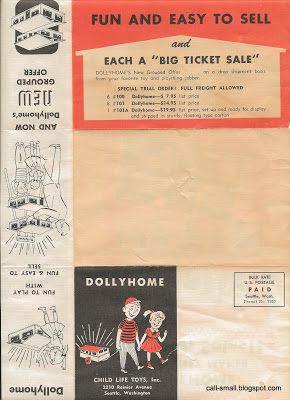
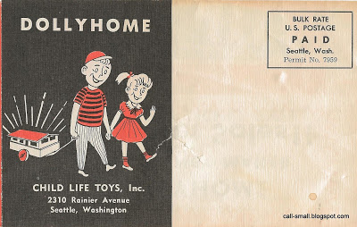
The set is in very good condition and came in its original box with directions and a promotional mailer.


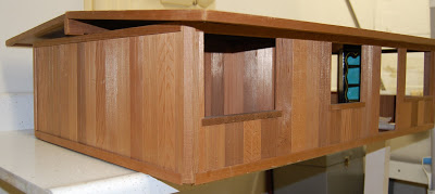
The furniture was made in 1957, specifically to be used with the Dollyhome contemporary ranch, which I actually used to have in my collection:


It was a lovely house, made of cedar and quite sturdy. But, the scale was large and it opened only from above, so I decided to sell it. It was a bear to ship, and I probably lost money on it. Oh well.

But, when I saw the furniture, I was intrigued and bought it even though I knew the scale would be large. I believe it to be closest to 1:6, but after looking through the set, I probably could get away with using a few of the pieces in 1:10 or even 1:12.

Curious what I found in the box? Here's a little visual journey...


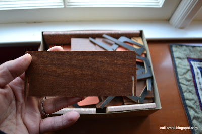
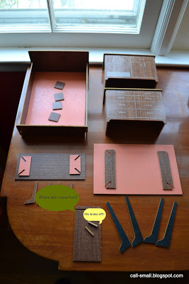
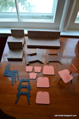
One piece is a mystery; and two pieces broke off. The squares on the bed are supports that get glued on the inside top and bottom of the bed frame to hold  up the main bed piece.

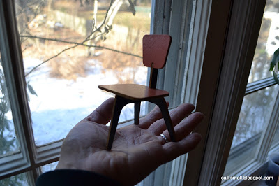
Everything looks to be there for the couch, side chair, and four dining chairs

The dresser might work in 1:12
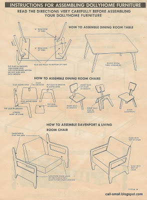
All the pieces are made of heavy duty fiberboard covered in a wood veneer. The couch and side chair are painted with a retro dotted pattern, whereas the dining chairs are salmon colored. The pieces are constructed by sliding the grooved sides together and securing them with glue. I was able to put the chair together by just sliding the pieces together, but the larger couch and side chair need their arms/legs glued. I am not sure when I will get to assembling them; I might do the coffee table and the other dining chairs first.

Hope you enjoyed this mini time travel trip! Let me know if you have any Dollyhome pieces, and I'd love to hear about some of your favorite "original box" moments!

Photo © 2013 About.com Inc
By the way...the About.com Readers' Choice Award nominations are now active! You can vote for your favorite blog, kit, and other mini world things. Get out the vote for your faves! I have!

Dear Girls Above Me: My First Book Cover

It seems fitting to mark the start of my fifth (!) year of blogging with a little (big) announcement!

I am consistently amazed at the depth of this mini universe. It's been incredibly rewarding to meet and connect with hobbyists, design aficionados, artisans, and the generally curious since I started this blog in 2009. Some of these connections resulted in collaborations, such as the styling and photography spread I did for Ladies' Home Journal on real-life clutter, the exhibit featuring a fully-furnished Kaleidoscope house at my local Design Within Reach store, and interviews, articles, and other coverage in publications around the world. In each of these cases, there was a genuine fascination with the modern twist on miniatures, which made these events and interactions even more gratifying. Without a doubt, the article on modern miniature design in the New York Times in 2010 definitely helped to spark people's interest in this emerging side of the hobby.

Just over one year ago, I was contacted by Crown Publishing Group, part of Random House, to design a cover for a book by first-time author Charlie McDowell titled Dear Girls Above Me. McDowell, a comedian and filmmaker (and son of actors Malcolm McDowell and Mary Steenburgen) has an incredibly popular Twitter feed about the actual "girls" who live in the apartment above him. This is Charlie:

Profile photo from Twitter

He cannot help but listen to their chatter, and he shares very entertaining bits of their conversations, addressing them "Dear GAM" ("Girls Above Me"). A few recent ones:

Dear GAM, “Hey Claire, can I borrow your car so I can pick up my car from the shop?” You might wanna also consider borrowing Claire.

— Charlie McDowell (@charliemcdowell) January 11, 2013

Dear GAM, "Poor Lance Armstrong. It's embarrassing enough that he has erectile dysfunction." Different performance enhancing drugs.

— Charlie McDowell (@charliemcdowell) January 14, 2013

Dear GAM, "I wish I knew a veteran so I could get some of these great deals at Nordstroms." Life. Liberty. Discounted pillow shams.

— Charlie McDowell (@charliemcdowell) November 12, 2012

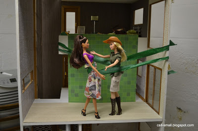
While I had not heard of McDowell, I became enamored with his posts and was excited by the prospect of doing the cover for his book. My contact at Crown, designer Jessie Bright, provided me with some very rough sketches, a color palette, and some screen shots from my blog that she thought would provide good starting inspiration. The basic concept was a cover that had Charlie sitting on a couch on the bottom half and the legs only of the "girls" on the top half. They asked that I keep the setting very minimal, i.e., do not create two whole apartments, and they also wanted me to use dolls so that it looked intentionally artificial. They wanted Charlie to have a retro/hip look and for the "girls" to be very...yes..GIRLIE!

The first step were the dolls. I normally do not use dolls in my scenes, but had some Kaleidoscope House figures, so I started experimenting. I decided to use my Citadel for this job, since it has the open double-height space.

This doll was not quite right (although they liked his legs), so they asked me to research other "modern" dolls. Jasper from "Twilight" was mostly just for fun...and he cannot sit!

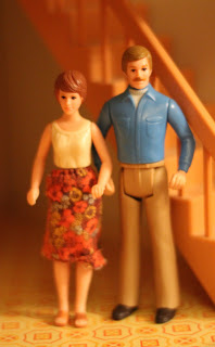
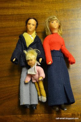
I then suggested the Dad that came with the TOMY Smaller Home and Garden dollhouse.

Courtesy of Andy&Shel on Flickr

Crown LOVED this look for Charlie and were not deterred by the fact that his legs did not bend. I thought I had one in my collection, but couldn't find him. I put out word on my Facebook page to see if anyone would be willing to loan one in pristine condition, and the lovely Susan H. came to the rescue! She kindly loaned him for four months as I experimented with Crown. Thanks again, Susan!!!!

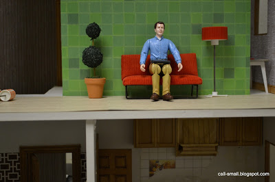
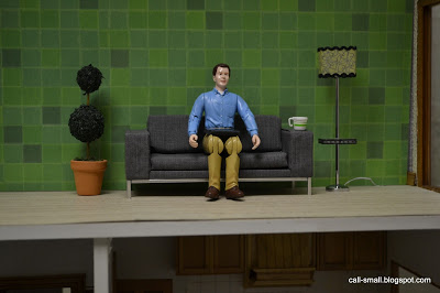
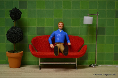
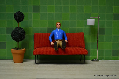
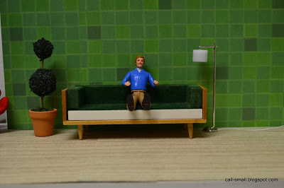
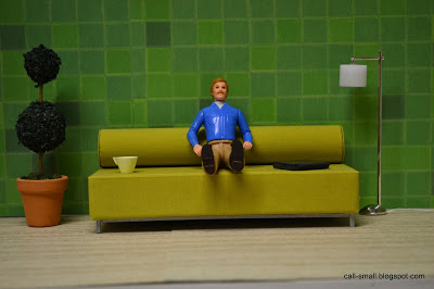
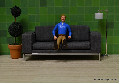
In terms of the setting, I researched some modern lamps and Crown liked this one from miniatures.com. The AG Minis topiary was a winner from the beginning. The flooring is wood grain paper from the Paper Source, and they asked that the backdrop be green, to make it easier to PhotoShop the final walls at the end. I shot "Charlie" on a few different couches. Here are some shots showing various couch options:

Too stylized

Too big

Too small

Too uncomfortable

Too contemporary

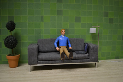
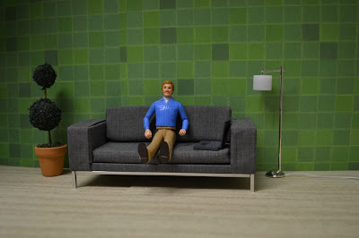
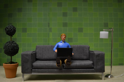
Just right! We all liked the grey couch best (created by the lovely Annina), so Crown asked that I do some shots from different angles with a laptop so that we could come up with Charlie's final pose:

Too passive

Too high above

Not quite

YES!!!

With Charlie figured out, I turned my attention to the "girls." I tried a few Kaleidoscope House dolls, but they did not make the cut.

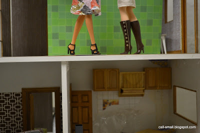
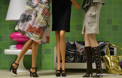
It was a good process to accessorize the space, but Crown decided they wanted it even more minimal. As I was figuring out the furnishings, I suggested using Barbie dolls, since we were going for a truly "girlie" look. I have to admit that I was intimidated by the large scale. I also had to confront the issue of making them stand and pose without stands, since I needed to keep my hands free to photograph. Here's how I did it...

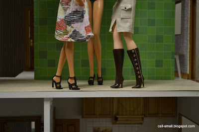
Painter's tape, while crude, did work!

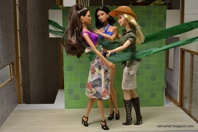
And then I added a third gal, at Crown's request.

The painter's tape approach did work. No Barbies were harmed during the shoot!

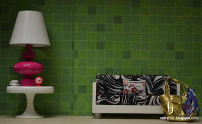
I think they worked really well with their lovely little legs! Crown requested that the girls be positioned closer together, and that the middle girl have a more form-fitting skirt. I got some black adhesive felt, which did the trick. I styled the background with one of my favorite vintage Bodo Hennig tables, a Barbie by Jonathan Adler pink lamp, and a cup/saucer and clock by Re-ment. The couch is AG Minis, and the pillow is by minimodernistas. The bag is Barbie's.

With the girls completed, I submitted the photos to Crown in May and they did their magic with the backdrops. As it turned out, Crown had to amend the TOMY doll's face to comply with legal, so he had a bit of a face lift and shirt makeover. They also used the Kaleidoscope Dad's bent legs! But everything else fit into place. 

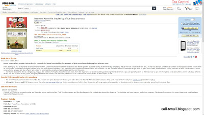
I am really pleased and excited. The book comes out in June and it's neat to see it on Amazon already.

Cool, right??

This was a great learning experience, and the folks at Crown were a real pleasure to partner with on this project. I'd love the opportunity to do more covers and styling in the future!

Thanks, Crown, and best of luck to Charlie McDowell and his book! I'm definitely getting a copy!!!

Bodensee by Bodo Hennig

 
I am finally ready to reveal my little (big) surprise, hinted to in this post. You all probably knew it was a new dollhouse, but did you guess it was a

Bodensee by Bodo Hennig??!!!

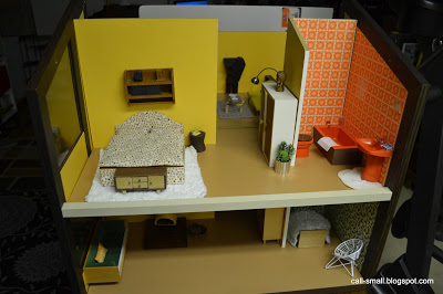
This house was on my "covet" list, after I first saw it on Rebecca's Collections and the puppenhausmuseum website a few years ago. Manufactured in 1981 by Bodo Hennig, and now generally quite scarce, the house is 1:10 scale, enormous, and heavy. I have never seen one pop up on eBay until this past December, on German eBay. I've bought doll houses from Germany and other countries before and it is not a walk in the park. The shipping is outrageous, and you can sometimes get stuck with a less-than-professional seller, leaving you on pins and needles until your house arrives. Well, I still paid a lot, but the seller was truly wonderful. She disassembled the house and packed it extremely well. Everything arrived intact. And the house is in phenomenal condition!

As expected with a Bodo Hennig product, it is exceedingly well-made (blogger diePuppenstubensammlerin wrote a great article about the company in Dolls House Past and Present -- check it out!). Every screw and part fits perfectly, and if they do not, then you are doing something wrong. It is constructed of solid particle board and wood, and many of the walls are sheathed in a formica-like material for the plain yellow walls, and colorful wallpaper on the other walls. There is nice glazing in the windows. The house measures 37" x 24" x 23" with a total of eight rooms and a large removable stairwell.

After unwrapping everything, I got started. I assembled it using photos of the house as a guide:

Big box!!!


I made a mistake with one of the walls, which I realized after the roof parts did not fit! DUH!

The tall white wall on the right is in the wrong spot!
 After I fixed the walls, the roof went in!


In order to get it off the floor, I took the roof apart so that I could separate the two parts of the house. My husband and I then lifted it onto one of my storage units. Many, many apologies for the surroundings...our basement is, well, a basement, so there are boxes, storage things, an elliptical machine, etc.

Here it is perched in its new spot.


I did some decorating, too. The house came with a lot of original Bodo Hennig furniture, lamps, and three dolls.


Do you like it??? It did take me forever to decorate...so many rooms! And so much space. Since the scale is 1:10, I had to look for some larger pieces in my collection.

I am so happy to have the house, and am excited to think of different ways to use the rooms and style it. If you have a Bodensee too, please share!!!

Credits: Ugh, so many to mention! The majority of the pieces are Bodo Hennig and vintage German pieces from my collection. A shout-out to Megan of Modern Mini Houses for the cool pillows on the green couch and the yellow couch!!!

The time it took me: Probably 2-1/2 hours to unpack and assemble (and partly re-assemble to move), and 1-1/2 hours of decorating. Maybe more. I did it over the course of last week and this week.