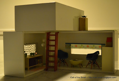
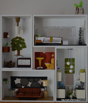
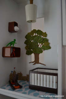
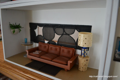
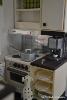
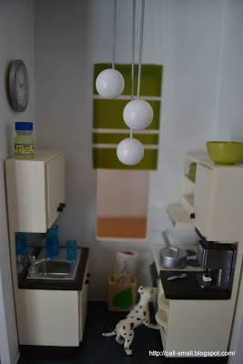
In my quest for sleek modernity in mini form, I gravitate to "home-grown" creations that showcase repurposing of everyday items. In the past, I've done this with the FISH HOTEL by Umbra, with an IKEA vegetable bin, and with my tissue box covers from Crate & Barrel. I decided to come back to the tissue box covers to attempt a new configuration. They actually were in an exhibit at Grounds for Sculpture here in my home state of New Jersey for a few months, where four of the rectangular boxes formed into a square "house." I cleaned off the gobs of tacky wax from the installation and started fresh with three.
Due to mess and other storage constraints, I often challenge myself to working with "minis within reach." This means I have to use whatever I can grab easily, so the items could be leftover from another scene, or new purchases that I have just opened, or things currently on view in other doll houses. It's limiting, but also liberating, because it frees up your mind to go with things that you normally might not have chosen and to make them work.
So...here is my take on a small modernist abode with three tissue box covers, working with minis within reach:
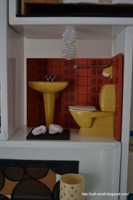
I like the effect overall, but of course the internal space is small and not overly realistic as a living space. Did you notice that I hid a bath upstairs? Nice and secluded spot for a dip!
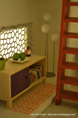
Did you also notice those cool books in the credenza and black and white file folders in the shelving unit? These were handmade by Margaret, who won my inaugural ***FREE ALERT*** on the Call of the Small Facebook page. Thanks so much for these unnecessary, but very appreciated, treats, which were joined by other books and office supplies! Anna-Maria was the winner of the July giveaway...a modern rocking chair is soon to be on its way to Australia! Stay tuned for the August giveaway!
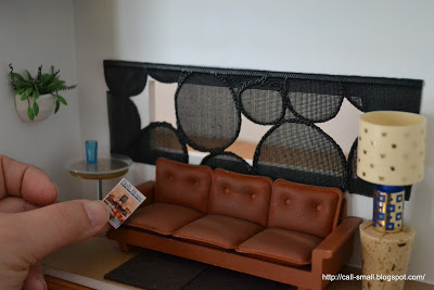
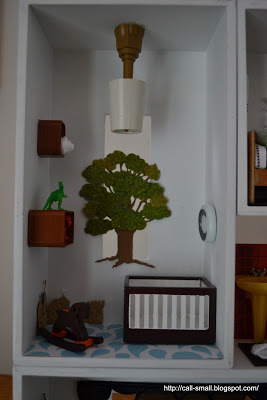
Credits: Chairs are Reac; egg table and white shelving unit are Re-ment; credenza is by MitchyMoo Miniatures; mini dollhouse is vintage TOMY; stairs are from my TOMY Sylvanian; globe lamp is by minimodernistas; tub is a condiment bowl from Crate & Barrel; blue stool is vintage German; pink flooring and blue flowered shade are adhesive ribbons from the Paper Source; other shade is a place mat by Chilewich; books in credenza are handmade by Margaret B; green vase was from a swap with the Shopping Sherpa; planter on roof is the sink from the Villa Sibi; "grass" on roof is a paint sample from Lowes. Accessories are AG Minis, Ryan's Room, Manor House Miniatures, Delph Miniatures, ELF Miniatures, and doll house store finds.
The time it took me: 44 minutes
