| I looked everywhere for this play scale model, only to find out that it was on the main wall text only, and was not included in the exhibition! |
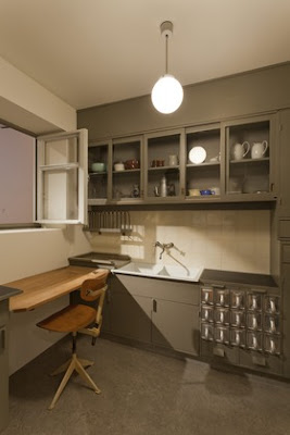
I did not do a linear circuit of the exhibition...perhaps it was because I was so excited to be on my own, sans the three kids, that I didn't quite know what to do with myself. Or, perhaps I was drawn to different parts of the installation for various reasons. I started with the incredible of-the-moment-looking "Frankfurt Kitchen," constructed in the late 1920s by Grete Schütte-Lihotzky for affordable housing units in Frankfurt. A recent MoMA acquisition on view for the first time, the kitchen is a minimalist lesson in organization and ergonomic ingenuity. And this was close to a century ago!
My somewhat crappy picture from the outside (you could not go in)
MoMA's much nicer one from the inside
 |
| Photo by Jonathan Muzikar |
I also enjoyed the inviting displays of functional objects, such as glass storage containers, salt and pepper shakers, and tea kettles...all of which would easily fit in today's kitchen:
| Love this graphically-strong photo by Russell Lee |
| Clever! |
| Looks mini to me! |
| A Tupperware party! Groovy! |
My last stop was the section that had photographs and other works focusing on the kitchen, or having to do with food, from the 1960s onward. Some of my favorites:
| Laurie Simmons' kitchen view - in miniature! |
| Cindy Sherman - love her work |
I have to admit that the whole time I was keeping a look out for that play scale kitchen that appears in all the ads for the show, but alas, it was only to be found on the introductory wall text!
Do visit the exhibition if you can and swing by the store too. If you can't make it to the show, the museum's website for it is filled with information, videos, resources, etc. -- have a look!
A last note: I created a Call of the Small page on Facebook as a way to keep connected to my readers -- if you are on Facebook, like me! I have a gadget on the sidebar of my blog. Thanks!
