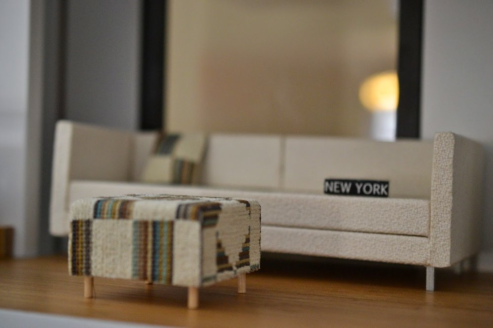
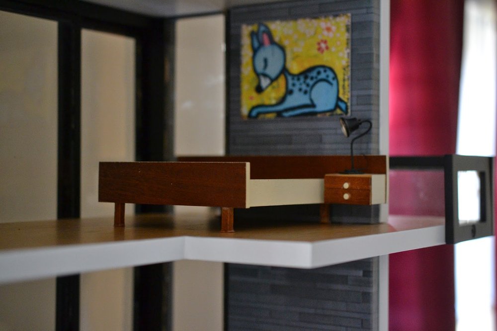
The article is about how to "spiff up" your home for spring, so I had a framework from the editorial team to get me started. The photo editor knew that they wanted a modern, clean interior with specific things such as a large mirror in the entryway, plants on the upper level, a fireplace with birch logs, etc. So even before I had the house in hand, I started to consider what would work best from my collection.
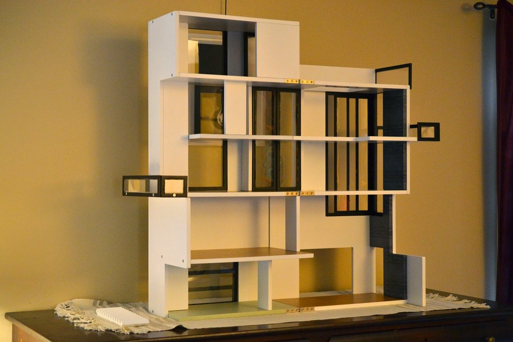
About that house...I had to completely assemble it as part of the job. So, it was shipped to me flat and I immediately got to work. I'll be honest--it took me many hours to identify and organize the pieces and also get the adhesive off the windows. There was a lot of mental and physical elbow grease up front, but the results were great. It's a fantastic house that is a joy to style.
Here is the completed house:
Once I had the Lundby set, the rest of the kitchen came together quickly. The ceiling light is from IKEA and came in handy, and the clock is a favorite of mine from Bandai. I paired some colorful Reac Eames chairs with a custom dining table by Patie of Minisx2 on Etsy. The doggie was not planned by the magazine, but I added him in, and he made the cut! I love the way this room turned out.
 |
| Yup, that's me |
 |
| No Eames for you! |
 |
| No Risom, either! |
 |
| They went for a Bodo Hennig chair instead, along with the globe fixture from minimodernistas. |
Since the magazine hired a studio to take the photos, I had to pack up each of the furnishings and label everything according to its location. I also took pictures of the placements just in case. I then boxed up the house and drove it into New York City, directly to Hearst Corporation, which publishes the magazine.
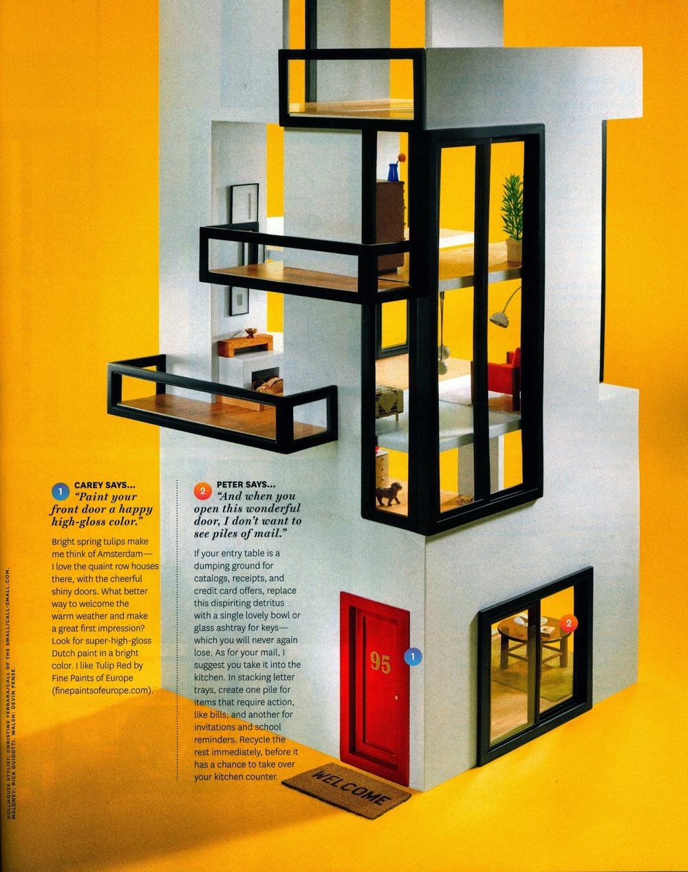 |
| The magazine added a red door, as well as a closet in the foyer |

