As I hinted in this post, I have been working on a unique and exciting book cover project since the winter. I can finally share it and am thrilled with the results!
Introducing....
Published by Quirk Books and due out in September 2014, Horrorstör is a murder mystery set in ORSK, an IKEA-like store. I styled and photographed the front and back covers and it was an exciting journey to bring the project to completion. I learned a lot along the way, and am proud of the outcome.
The author, Grady Hendrix, is a writer and former film critic who is one of the founders of the Asian Film Festival. He has written fiction and non-fiction, and Horrorstör is a sharp, spooky ghost tale with a sense of humor.
Intrigued? It gets better.
The book is sized and packaged like a retail catalog, including illustrations of ready-to-assemble furnishings. (I cannot reveal the interior at this point, but the publisher will soon.) The catalog approach was the key inspiration for the cover design, and of course was driven by the story line. I worked with Andie Reid, one of Quirk's very talented designers, and she provided the overall creative direction: the front cover should be a closeup of a showroom-type interior, be well-lit and modern, and employ a blue and yellow accents; the back would be a creepy interior counterpart.
As with my last cover, Dear Girls Above Me by Charlie McDowell, the cover came together after a series of months collaborating with the publisher. While the vision was clear from the beginning, Andie and I both contributed new ideas along the way to produce the best possible results. I tried new techniques and tools with this job -- I bought an external flash and macro lens, which greatly improved the quality of the photographs, and I also utilized Olioboard to help visualize the space and exchange ideas with Andie.
After choosing my trusty Citadel dollhouse as the location, a big part of my job at the beginning was sourcing all the furnishings for the project, which took a number of weeks. The starting concept included a dining scene for the back cover, inspired by actual IKEA products. We gravitated toward these furnishings:
 |
| Stockholm Table |
 |
| Sigurd Chair |
 |
| Foto Pendant Lamp |
Unfortunately, none of these pieces were used, since it was decided to do a version of the living room scene on the back instead.
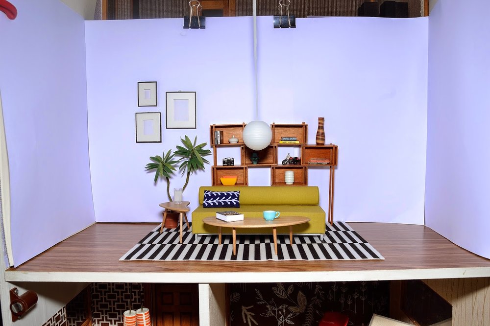
The living room scene was really fun to put together, and the unique shelving unit by Patie nicely tied it all together. It's a great modular piece and so well made. Patie also made the boomerang tables. The Tootsie Roll sofa by minimodernistas was already in my collection and it ended up being a great fit. I chose a few different minimodernistas pillows and the arrow one worked best...it was my way of pointing to the spooky back cover. :)
The frames are from Paris Renfroe, who also provided an arm chair and gorgeous black console, but they got edited out in the process. The plant is AG Minis and the rug is IKEA (of course!). The flooring is Contact paper and worked quite well. I used bright white craft paper for the walls, held up with binder clips. Here is a picture of the work space, which also shows a Lundby hanging fixture, also not used:
For the back cover, I shot the same living room scene, but stripped it of many of the accessories. Andie then did her magic with PhotoShop and transformed it into a mirror image of the front. It's an utterly dark and murky scene, with all new details by Andie on the floor, walls, and inside Patie's shelving unit. So clever!
I hope you enjoyed this cover reveal and I am happy to be finally in a position to share the news. The book is available for pre-order now on Amazon and Barnes & Noble, and is also available on Kindle, Nook, and eBooks. Also, the Book Smugglers site is doing a giveaway -- go enter now!


