Opposing Views


Once my TOMY Smaller Home and Garden came to live in my dollhouse room, it ended up facing my Kaleidoscope House. They couldn't be more different, of course--not only in scale and shape, but color. The K House is a multi-colored gem that shifts hues as you play in it and move the plexi panels, while the TOMY is a study in neutral yellows, tans, and browns.

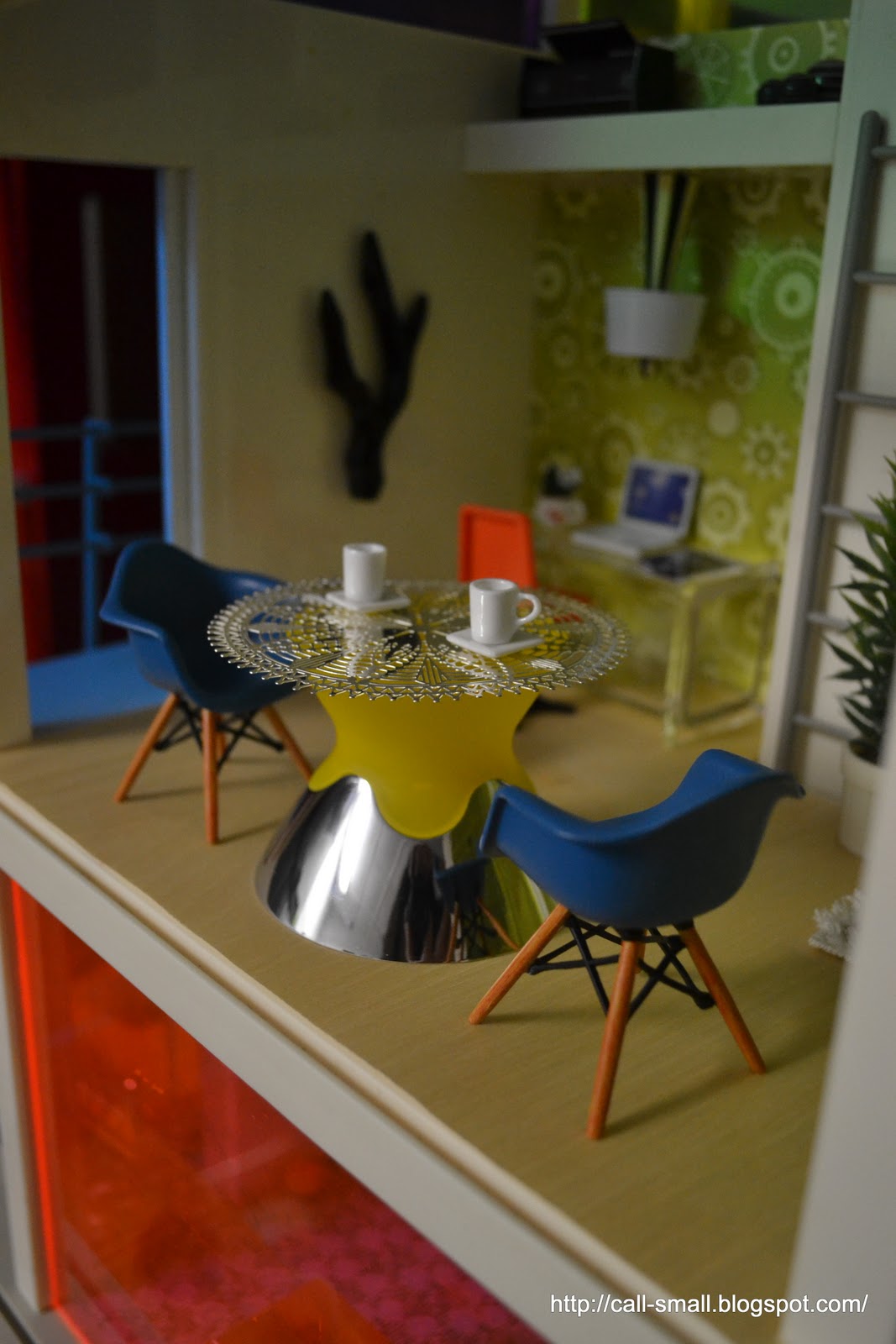
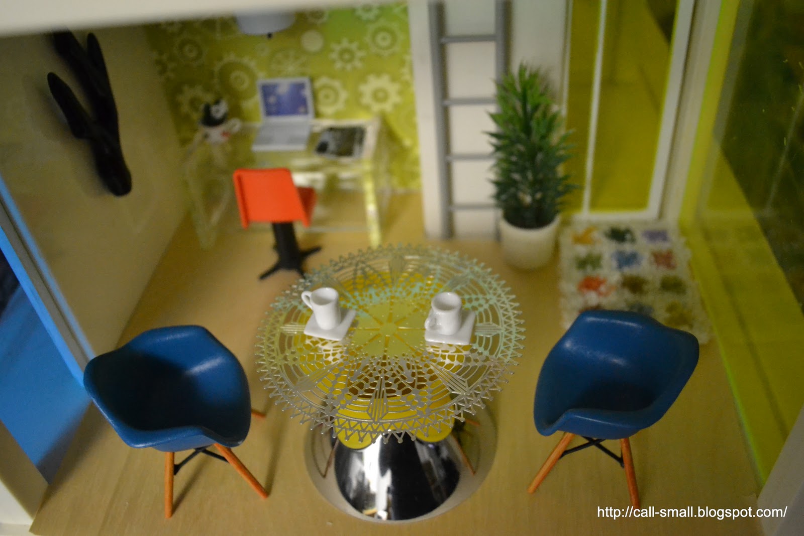
I worked on a scene in the K House that was all about bold strokes of color. This is a case where I would only do this in 1:12 scale, instead of my 1:1 life. I picked up the table base in the clearance section of TJ Maxx for $2, and have no clue what is supposed to be. I am sure that there are pieces to it missing. It has the word "limonata" on it, which I know is a tasty fizzy drink, but who knows.


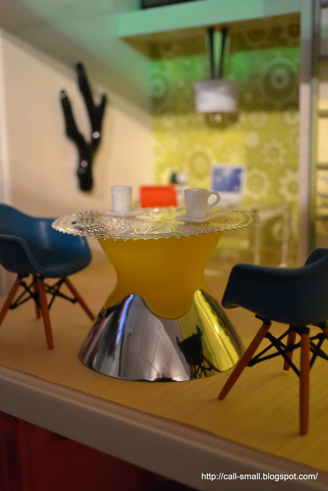
See the blond wood flooring (it's actually a sheet from the Paper Source)? What do you think of this look for the K House? This is my first time experimenting with any wood-type flooring here. I think I dig it.


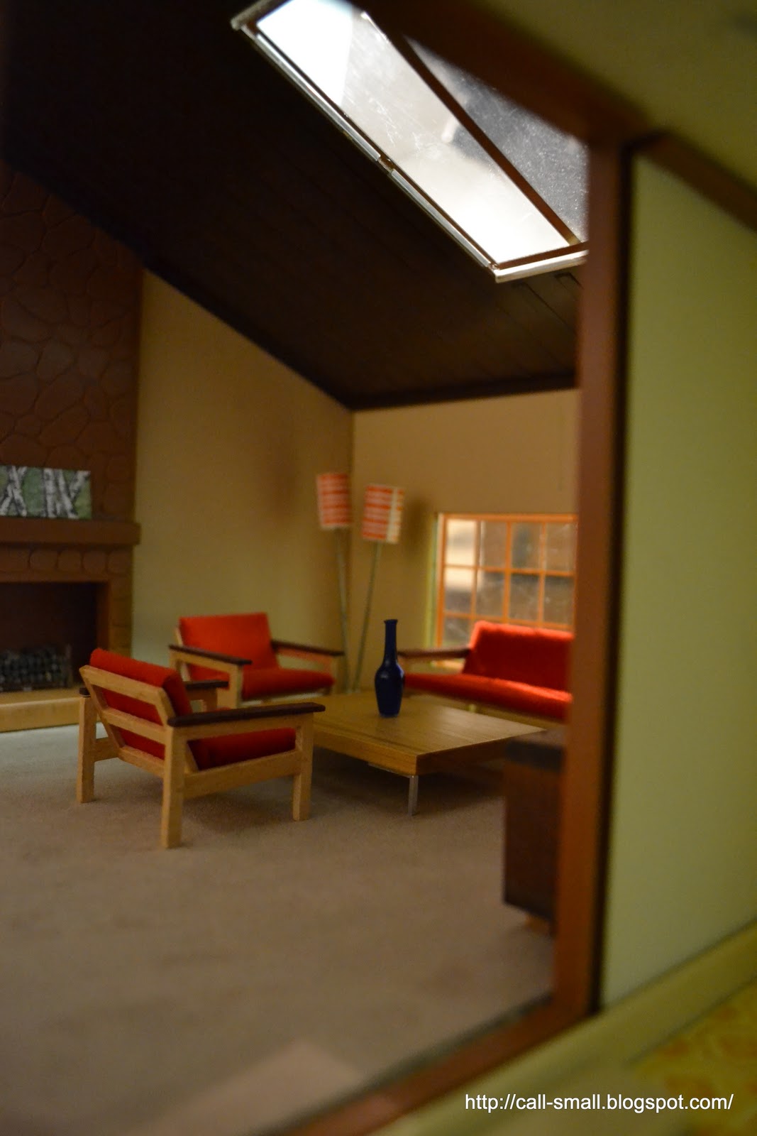
After finishing that scene, I decided to throw a very quick one together "across the street" in the TOMY. Thus far I have only set up scenes in the upstairs, so I decided to use the living room space. Really only 1:16 or smaller works in this room -- most of the 1:12 pieces I tried looked so gigantic. So in went my vintage LISA set and a diminutive 1:12-scale PRD Miniatures coffee table along with some other neutral pieces.


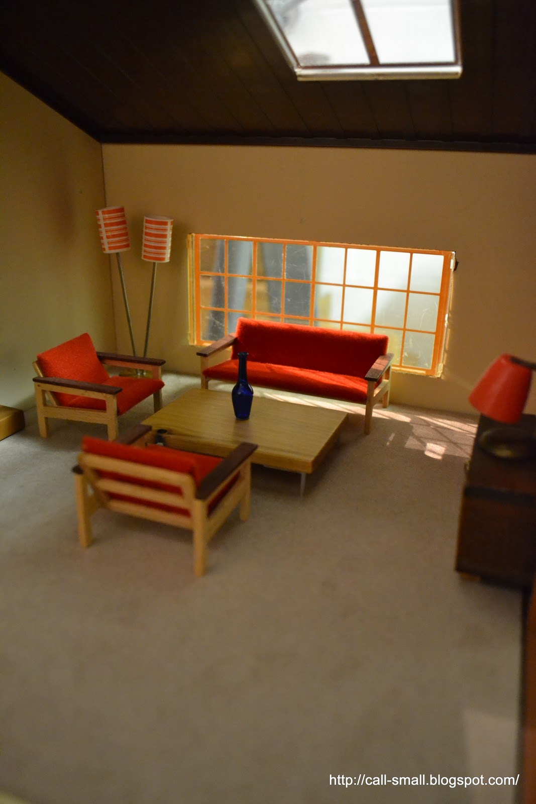
Quite the opposite of the limonata, eh?

Credits: K House: Table base is from TJ Maxx, and top of the table is a holiday ornament from Crate and Barrel; Eames molded chairs are Reac; desk chair is vintage Wolverine; desk is a plastic box; plant is vintage TOMY; wall art is a jewelry charm from Michaels, and the wallpaper is also from there; fixture is by Bozart; record player on top shelf is from a set of Japanese magnets; wood flooring is from the Paper Source; rug is Peppercorn Minis. Accessories are Re-ment, AG Minis, beads from Pubdoll, ELF Miniatures, and dollhouse store finds. TOMY: Couch and chairs are vintage LISA; standing lamp and plant are vintage Lundby; coffee table is PRD Miniatures; side table is vintage German, as is the table lamp; logs are a train layout accessory from Michaels; picture on fireplace mantle is by Gigi N Studio, and vase is from a dollhouse store, don't remember which one.

Re-ment: I've written about the Re-ment in these scenes with one exception, in the K House scene. The flower pot receptacle on the desk is a tea pot from Fairytale Tableware #4, and is good for 1:12.

Counter Space at MoMA

I looked everywhere for this play scale model, only to find out that it was on the main wall text only, and was not included in the exhibition!
I had the opportunity to spend some time at the exhibition Counter Space: Design + the Modern Kitchen at the Museum of Modern Art in New York City, which remains open until May 2. If you are in or near NYC in the coming months, I'd definitely recommend a visit to this visually rich, interesting, and fun installation of the evolution of the modern kitchen. There's a big design quotient here, so plenty of industrial design eye candy, as well as posters, photographs, and multimedia displays. While there is a lot of content, it is all laid out in a somewhat contained space designed both for meandering and for focused looks at all the various pieces of history. You will definitely learn something.

I did not do a linear circuit of the exhibition...perhaps it was because I was so excited to be on my own, sans the three kids, that I didn't quite know what to do with myself. Or, perhaps I was drawn to different parts of the installation for various reasons. I started with the incredible of-the-moment-looking "Frankfurt Kitchen," constructed in the late 1920s by Grete Schütte-Lihotzky for affordable housing units in Frankfurt. A recent MoMA acquisition on view for the first time, the kitchen is a minimalist lesson in organization and ergonomic ingenuity. And this was close to a century ago!

My somewhat crappy picture from the outside (you could not go in)


MoMA's much nicer one from the inside
Photo by Jonathan Muzikar
Another highlight for me was the range of posters in the exhibition that helped to highlight pre- and post-war imagery and sentiment:


The middle portion of the exhibit was devoted to design innovation in the kitchen and home, from a Dyson vacuum to vegetable peelers, to knives, to bowls, and everything in between:


I also enjoyed the inviting displays of functional objects, such as glass storage containers, salt and pepper shakers, and tea kettles...all of which would easily fit in today's kitchen:


Many drawings, photographs, brochures, and booklets helped with the context for these objects and the trends in kitchen design:


Love this graphically-strong photo by Russell Lee

Clever!


Looks mini to me!


A Tupperware party! Groovy!
My last stop was the section that had photographs and other works focusing on the kitchen, or having to do with food, from the 1960s onward. Some of my favorites:

Laurie Simmons' kitchen view - in miniature!

Cindy Sherman - love her work
I have to admit that the whole time I was keeping a look out for that play scale kitchen that appears in all the ads for the show, but alas, it was only to be found on the introductory wall text!


Do visit the exhibition if you can and swing by the store too. If you can't make it to the show, the museum's website for it is filled with information, videos, resources, etc. -- have a look!

A last note: I created a Call of the Small page on Facebook as a way to keep connected to my readers -- if you are on Facebook, like me! I have a gadget on the sidebar of my blog. Thanks!